Documentation for the "rstk::chart" module - a wrapper around tklib’s Plotchart library.
The following examples should help in getting started with using plotchart through rstk - but also see the API documentation.
For more information on plotchart itself, see:
-
the plotchart documentation, which, although out of date in places, should be read in parallel with these notes;
-
the examples provided below, many of which translate the tcl examples; or even
-
the tklib/plotchart source.
|
|
Many options in plotchart are not available in rstk. |
1. Getting Started
For installation, see rstk - you must have "tklib" installed to use this module.
All of the examples here (and more) are available for download:
-
download "rstk-chart-examples.zip" from latest version
After unzipping the archive, the file structure is:
$ tree .
.
├── Cargo.toml
├── examples
│   ├── bar_chart.rs
│   ├── box_chart.rs
|   ... etc
To run the bar-chart example, use:
$ cargo run --example bar_chart
The "rstk" crate will be installed when you run your first example.
|
|
To save some repetition, examples written without main will assume the following template: |
use rstk::*;

fn main() {
    let root = rstk::start_wish().unwrap();

    // PASTE THE EXAMPLE HERE

    rstk::mainloop();
}
rstk::mainloop();
}| Replace this comment with the example code. |
2. Plotchart
The TkPlotchart trait is used by all charts and provides methods for:
-
setting the title text;
-
setting axis titles, definitions and presence of tickmarks;
-
balloon text (text with a pointer to a location on the chart);
-
plain text (text placed directly on the chart);
-
control over the chart legend;
-
saving the chart to a postscript file;
-
and others …
Some top-level functions, like after and windowing_system, are listed
under widget.
3. Bar Chart
Bar charts can display bars vertically or horizontally.
3.1. Vertical bar chart
Documentation on:
-
constructor - make_bar_chart
-
struct - TkBarChart
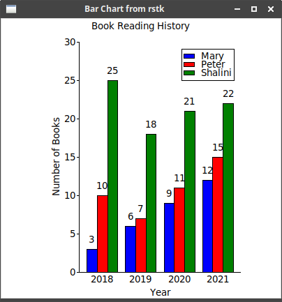
![]() Example ("bar_chart.rs"):
Example ("bar_chart.rs"):
root.title("Bar Chart from rstk");
let canvas = rstk::make_canvas(&root);
canvas.height(400);
canvas.width(400);
canvas.background("white");
canvas.grid().layout();
let bar_chart = rstk::make_bar_chart(&canvas,
&["2018", "2019", "2020", "2021"],
(0.0, 30.0, 5.0),
rstk::BarSeries::Count(3),
0.0);
bar_chart.title("Book Reading History", rstk::Justify::Centre);  bar_chart.x_title("Year");
bar_chart.v_title("Number of Books");
bar_chart.show_values(true);
bar_chart.x_title("Year");
bar_chart.v_title("Number of Books");
bar_chart.show_values(true);  bar_chart.plot("person-1", &[3.0, 6.0, 9.0, 12.0], "blue");
  bar_chart.plot("person-2", &[10.0, 7.0, 11.0, 15.0], "red");
bar_chart.plot("person-3", &[25.0, 18.0, 21.0, 22.0], "green");
bar_chart.legend_position(rstk::Position::TopRight);
bar_chart.legend("person-1", "Mary");
bar_chart.plot("person-2", &[10.0, 7.0, 11.0, 15.0], "red");
bar_chart.plot("person-3", &[25.0, 18.0, 21.0, 22.0], "green");
bar_chart.legend_position(rstk::Position::TopRight);
bar_chart.legend("person-1", "Mary");  bar_chart.legend("person-2", "Peter");
bar_chart.legend("person-3", "Shalini");
bar_chart.legend("person-2", "Peter");
bar_chart.legend("person-3", "Shalini");| Creates an instance of the bar chart, with years to label the x-axis and a min-max-step triple to define the y-axis values. It’s important to get the number of series right, for the spacing. | |
| These three lines set the title and axis-titles for the plot. | |
| Tells the bar chart to display the values above the bars. | |
| Add each set of values in turn - the "series" label is for reference only. | |
| We only get a legend if we attach a name to the "series" label. |
3.2. Horizontal Bar Chart
Documentation on:
-
constructor - make_horizontal_bar_chart
-
struct - TkHorizontalBarChart
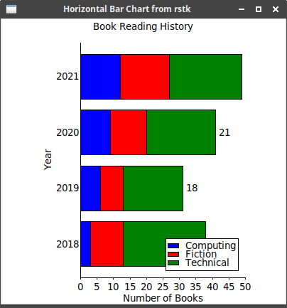
![]() Example ("horizontal_bar_chart.rs"):
Example ("horizontal_bar_chart.rs"):
root.title("Horizontal Bar Chart from rstk");

let canvas = rstk::make_canvas(&root);
canvas.height(400);
canvas.width(400);
canvas.background("white");
canvas.grid().layout();

let bar_chart = rstk::make_horizontal_bar_chart(&canvas,
                                                (0.0, 50.0, 5.0),
                                                &["2018", "2019", "2020", "2021"],
                                                rstk::BarSeries::Stacked);
bar_chart.title("Book Reading History", rstk::Justify::Centre);
bar_chart.x_title("Number of Books");
bar_chart.v_title("Year");

bar_chart.show_values(true);
bar_chart.plot("type-1", &[3.0, 6.0, 9.0, 12.0], "blue");
bar_chart.plot("type-2", &[10.0, 7.0, 11.0, 15.0], "red");
bar_chart.plot("type-3", &[25.0, 18.0, 21.0, 22.0], "green");

bar_chart.legend_position(rstk::Position::BottomRight);
bar_chart.legend_spacing(12);
bar_chart.legend("type-1", "Computing");
bar_chart.legend("type-2", "Fiction");
bar_chart.legend("type-3", "Technical");| This time, stack the bars. | |
| Adjust the position and spacing of items in the legend, for clarity. |
4. Box Plot
Box plots can display bars vertically or horizontally.
Documentation on:
-
constructor - make_box_plot and make_horizontal_box_plot
-
struct - TkBoxPlot and TkHorizontalBoxPlot
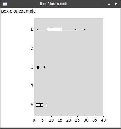
![]() Example ("box_plot.rs"):
Example ("box_plot.rs"):
root.title("Box Plot in rstk");
let canvas = rstk::make_canvas(&root);
canvas.width(400);
canvas.height(400);
canvas.grid().layout();

let box_plot = rstk::make_horizontal_box_plot(&canvas,
                                              (0.0, 40.0, 5.0),
                                              &["A", "B", "C", "D", "E"]);
box_plot.title("Box plot example", rstk::Justify::Left);

box_plot.plot("data1", "A", &[0.0, 1.0, 2.0, 5.0, 7.0, 1.0, 4.0, 5.0, 0.6,
                              5.0, 5.5]);
box_plot.plot("data2", "C", &[2.0, 2.0, 3.0, 6.0, 1.5, 3.0]);
box_plot.plot("data3", "E", &[2.0, 3.0, 3.0, 4.0, 7.0, 8.0, 9.0, 9.0, 10.0,
                              10.0, 11.0, 11.0, 11.0, 14.0, 15.0, 17.0, 17.0,
20.0, 24.0, 29.0]);| The box-plot function determines its plotted form from a list of numbers. |
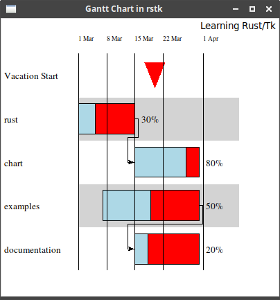
5. Gantt Chart
Documentation on:
-
constructor - make_gantt_chart
-
struct - TkGanttChart
After calling the above constructor, use a "builder" style to add options to
the chart, before calling plot to finally construct it. The options are defined in:
![]() Example ("gantt_chart.rs"):
Example ("gantt_chart.rs"):
root.title("Gantt Chart in rstk");

let canvas = rstk::make_canvas(&root);
canvas.width(400);
canvas.height(400);
canvas.background("white");
canvas.grid().layout();

let gantt = rstk::make_gantt_chart(&canvas, "1 March 2021", "10 April 2021")
    .num_items(5)
    .ylabel_width(15)
    .plot();
gantt.milestone("Vacation Start", "20 March 2021", "red");
let task_1 = gantt.task("rust", "1 March 2021", "15 March 2021", 30);
let task_2 = gantt.task("chart", "15 March 2021", "31 March 2021", 80);
let task_3 = gantt.task("examples", "7 March 2021", "31 March 2021", 50);
let task_4 = gantt.task("documentation", "15 March 2021", "31 March 2021", 20);

gantt.connect(&task_1, &task_2);
gantt.connect(&task_3, &task_4);

gantt.draw_line("1 Mar", "1 March 2021", "blue");
gantt.draw_line("8 Mar", "8 March 2021", "green");
gantt.draw_line("15 Mar", "15 March 2021", "green",);
gantt.draw_line("22 Mar", "22 March 2021", "green");
gantt.draw_line("1 Apr", "1 April 2021", "blue");

gantt.title("Learning Rust/Tk", rstk::Justify::Right);
gantt.uncompleted_colour("red");| It is useful to give the chart more space than your tasks, to fit the information. | |
| Milestones are set for specific dates. | |
| Tasks are set with a start and end date, and a percentage completed. | |
| Connect tasks, to show a dependency. | |
| Lines are useful to highlight times. |
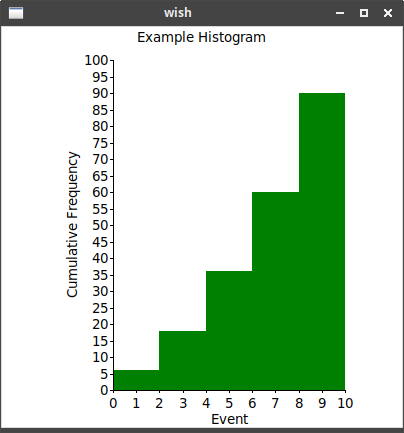
6. Histogram
Documentation on:
-
constructor - make_histogram
-
struct - TkHistogram
After calling the above constructor, use a "builder" style to add options to
the chart, before calling plot to finally construct it. The options are defined in:
Once constructed, Tk’s "dataconfig" functions are replaced by methods in TkChartSeries.
![]() Example ("histogram.rs"):
Example ("histogram.rs"):
let canvas = rstk::make_canvas(&root);
canvas.width(400);
canvas.height(400);
canvas.background("white");
canvas.grid().layout();

let histogram = rstk::make_histogram(&canvas, (0.0, 10.0, 1.0), (0.0, 100.0, 5.0))
    .plot();
histogram.title("Example Histogram", rstk::Justify::Centre);
histogram.v_title("Cumulative Frequency");
histogram.x_title("Event");
histogram.series_colour("data", "green");
histogram.series_style("data", rstk::HistogramStyle::Filled);
histogram.series_fill_colour("data", "green");

for i in (2..=10).step_by(2) {
    let i = i as f64;
    histogram.plot_cumulative("data", (i, i*3.0));
}
Notice that i defines the right hand edge value of each bar. |
7. Isometric Plot
Documentation on:
-
constructor - make_isometric_plot
-
struct - TkIsometricPlot
![]() Example ("isometric_plot.rs"):
Example ("isometric_plot.rs"):
root.title("Isometric Plot in rstk");

let canvas = rstk::make_canvas(&root);
canvas.width(400);
canvas.height(400);
canvas.background("white");
canvas.grid().layout();

let iso_plot = rstk::make_isometric_plot(&canvas,
                                         (0.0, 100.0),
                                         (0.0, 200.0),
                                         rstk::StepSize::NoAxes);
iso_plot.rectangle((10.0, 10.0), (50.0, 50.0), "green");
iso_plot.filled_rectangle((20.0, 20.0), (40.0, 40.0), "red");
iso_plot.filled_circle((70.0, 70.0), 40.0, "yellow");
iso_plot.circle((70.0, 70.0), 42.0, "black");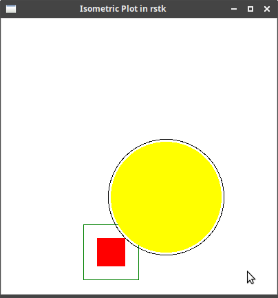
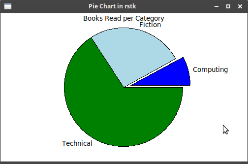
8. Pie Chart
Documentation on:
-
constructor - make_pie_chart
-
struct - TkPieChart
![]() Example ("pie_chart.rs"):
Example ("pie_chart.rs"):
root.title("Pie Chart in rstk");

let canvas = rstk::make_canvas(&root);
canvas.width(500);
canvas.height(300);
canvas.background("white");
canvas.grid().layout();

let pie_chart = rstk::make_pie_chart(&canvas);
pie_chart.title("Books Read per Category", rstk::Justify::Centre);
pie_chart.plot(&[("Computing", 3.0), ("Fiction", 10.0), ("Technical", 25.0)]);
pie_chart.explode(0); | List of (label value) pairs defines the three slices | |
| Highlights the first slice |
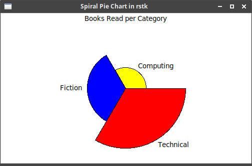
8.1. Spiral Pie
A variation on the pie chart, where the values specify a radius instead of an angle.
Documentation on:
-
constructor - make_spiral_pie_chart
-
struct - TkSpiralPieChart
![]() Example ("spiral_pie_chart.rs"):
Example ("spiral_pie_chart.rs"):
root.title("Spiral Pie Chart in rstk");

let canvas = rstk::make_canvas(&root);
canvas.width(500);
canvas.height(300);
canvas.background("white");
canvas.grid().layout();

let spiral_pie = rstk::make_spiral_pie_chart(&canvas);
spiral_pie.colours(&["yellow", "blue", "red"]);

spiral_pie.title("Books Read per Category", rstk::Justify::Centre);
spiral_pie.plot(&[("Computing", 3.0), ("Fiction", 10.0), ("Technical", 25.0)]);| Specify the colours to use, in slice order. |
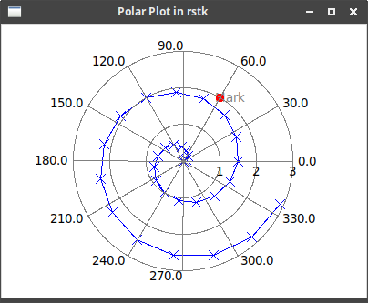
9. Polar Plot
Documentation on:
-
constructor - make_polar
-
struct - TkPolarPlot
![]() Example ("polar_plot.rs"):
Example ("polar_plot.rs"):
root.title("Polar Plot in rstk");

let canvas = rstk::make_canvas(&root);
canvas.width(400);
canvas.height(300);
canvas.background("white");
canvas.grid().layout();

let polar_plot = rstk::make_polar(&canvas, (3.0, 1.0));

polar_plot.series_colour("line", "blue");
polar_plot.series_drawing_mode("line", rstk::DrawingMode::Both);
polar_plot.series_symbol("line", rstk::Symbol::Cross, 5);

for i in 0..30 {
    let i = i as f64;
    let r = i/10.0;
    let a = i*24.0;

    polar_plot.plot("line", (r, a));
}

polar_plot.draw_labelled_dot((2.0, 60.0), "Mark", rstk::Location::North); | The line drawn on a polar plot can be configured with colour and symbol type | |
| Draw a label/dot on the plot |
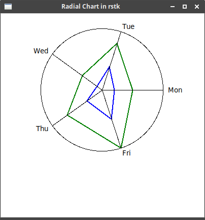
10. Radial Chart
Documentation on:
-
constructor - make_radial_chart
-
struct - TkRadialChart
![]() Example ("radial_chart.rs"):
Example ("radial_chart.rs"):
root.title("Radial Chart in rstk");

let canvas = rstk::make_canvas(&root);
canvas.width(400);
canvas.height(400);
canvas.background("white");
canvas.grid().layout();

let radial_chart = rstk::make_radial_chart(&canvas,
                                           &["Mon", "Tue", "Wed", "Thu", "Fri"],
                                           10.0,
                                           rstk::RadialStyle::Lines);
radial_chart.plot(&[5.0, 8.0, 4.0, 7.0, 10.0], "green", 2);
radial_chart.plot(&[2.0, 4.0, 1.0, 3.0, 5.0], "blue", 2);| Constructor gives labels for the spokes and scale is used for radius. | |
| Plot adds a line of data to the chart. |
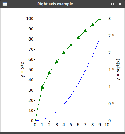
11. Right Axis
Documentation on:
-
constructor - make_right_axis
-
struct - TkRightAxis
![]() Example ("right_axis.rs"):
Example ("right_axis.rs"):
root.title("Right axis example");

let canvas = rstk::make_canvas(&root);
canvas.width(400);
canvas.height(400);
canvas.background("white");
canvas.grid().layout();

let xy_plot = rstk::make_x_y(&canvas, (0.0, 10.0, 1.0), (0.0, 100.0, 10.0))
    .plot();
let right_axis = rstk::make_right_axis(&canvas, (0.0, 3.0, 0.5));

xy_plot.v_title("y = x*x");
right_axis.v_title("y = sqrt(x)");

xy_plot.series_colour("squares", "blue");
right_axis.series_colour("roots", "green");
right_axis.series_drawing_mode("roots", rstk::DrawingMode::Both);
right_axis.series_symbol("roots", rstk::Symbol::UpFilled, 5);

for i in 0..10 {
    let i = i as f64;
    xy_plot.plot("squares", (i, i*i));
    right_axis.plot("roots", (i, i.sqrt()));
}| Right axis is added to an existing plot, but has its own y-axis range. | |
| Separate labels can be used for the main plot and the right axis. | |
| And values plotted against the right axis can have their own configuration. | |
Use the plot method to add data to the right-axis plot. |
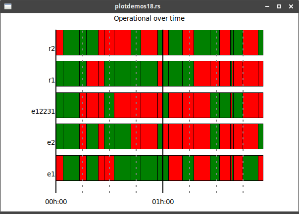
12. Status Timeline
Documentation on:
-
constructor - make_status_timeline
-
struct - TkStatusTimeline
![]() Example ("plotdemos18.rs") is a conversion of a tklib example:
Example ("plotdemos18.rs") is a conversion of a tklib example:
use rstk::*;
use rand::Rng;

fn rand(upper: f64) -> f64 {
    rand::thread_rng().gen_range(0.0..upper)
}

fn main() {
    let root = rstk::start_wish().unwrap();
    root.title("plotdemos18.rs");

    let canvas = rstk::make_canvas(&root);
    canvas.width(600);
    canvas.height(400);
    canvas.background("white");
    canvas.grid().layout();

    let devices = vec!["e1", "e2", "e12231", "r1", "r2"];
    let timeline = rstk::make_status_timeline(&canvas,
                                              (0.0, 7200.0, 900.0),
                                              &devices,
                                              false);
    timeline.title("Operational over time", rstk::Justify::Centre);

    // add randomised data
    let mut last_i = 0.0;
    let mut i = rand(10.0);
    while i < 7200.0 {
        for item in devices.iter() {
            timeline.plot(&item, last_i, i,
                          if rand(1.0) > 0.5 { "red" } else { "green" });
        }
        last_i = i;
        i += rand(600.0);
    }

    // add labelled vertical lines
    for x in (0..7200).step_by(900) {
        let text = format!("{:02}h:{:02}", x/3600, x % 60);
        if (x % 3600) == 0 {
            timeline.draw_line(&text, x as f64, "black",
                               rstk::ChartDash::Lines, 2.0);
        } else {
            timeline.draw_line("", x as f64, "grey", rstk::ChartDash::Dots3, 2.0);
        }
    }

    rstk::mainloop();
}| Creates the chart with labelled y-axis, and no x-axis showing | |
| Adds a random 'patch' to the plot, in given series | |
| Draws a vertical line, using given style |
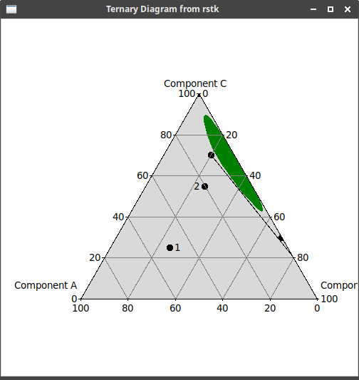
13. Ternary Diagram
Documentation on:
-
constructor - make_ternary_diagram
-
struct - TkTernaryDiagram
![]() Example ("ternary_diagram.rs"), translation of tcl "test_ternary.tcl":
Example ("ternary_diagram.rs"), translation of tcl "test_ternary.tcl":
root.title("Ternary Diagram from rstk");

let canvas = rstk::make_canvas(&root);
canvas.height(500);
canvas.width(500);
canvas.grid().layout();

let ternary_diagram = rstk::make_ternary_diagram(&canvas, false, 5);
ternary_diagram.corner_titles("Component A", "Component B", "Component C");
ternary_diagram.plot("data", (50.0, 25.0, 25.0), "1", rstk::Direction::West);
ternary_diagram.plot("data", (20.0, 25.0, 55.0), "2", rstk::Direction::East);
ternary_diagram.draw_line("data", &[(0.0, 80.0, 20.0), (10.0, 20.0, 70.0)]);

ternary_diagram.series_colour("area", "green");
ternary_diagram.series_smooth("area", true);
ternary_diagram.draw_filled_polygon("area", &[(0.0, 70.0, 30.0),
                                              (10.0, 20.0, 70.0),
                                              (0.0, 0.0, 100.0)]);
ternary_diagram.plot("area1", (0.0, 70.0, 30.0), "", rstk::Direction::West);
ternary_diagram.plot("area1", (10.0, 20.0, 70.0), "", rstk::Direction::West);
ternary_diagram.plot("area1", (0.0, 0.0, 100.0), "", rstk::Direction::West);

ternary_diagram.draw_ticklines("grey"); 
| Labels the three corners of the diagram | |
| Places a labelled 'dot' at given coordinates | |
| Optional direction arranges label relative to the dot | |
| Lines defined as points, each point a triple of values | |
| Set some drawing properties | |
| Adding ticklines results in a triangular grid over the diagram |
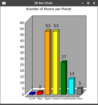
14. 3D Bar Chart
Documentation on:
-
constructor - make_3d_bar_chart
-
struct - Tk3DBarChart
![]() Example ("threed_bar_chart.rs"):
Example ("threed_bar_chart.rs"):
root.title("3D Bar Chart");

let canvas = rstk::make_canvas(&root);
canvas.width(400);
canvas.height(400);
canvas.background("white");
canvas.grid().layout();

let bar_3d = rstk::make_3d_bar_chart(&canvas, (0.0, 60.0, 5.0), 7);

bar_3d.title("Number of Moons per Planet", rstk::Justify::Centre);
bar_3d.label_font(&rstk::TkFont {
    family: String::from("Times"),
    size: 8,
    ..Default::default()
});
bar_3d.show_background(true);

bar_3d.plot("Earth", 1.0, "blue");
bar_3d.plot("Mars", 2.0, "red");
bar_3d.plot("Jupiter", 53.0, "orange");
bar_3d.plot("Saturn", 53.0, "yellow");
bar_3d.plot("Uranus", 27.0, "green");
bar_3d.plot("Neptune", 13.0, "cyan");
bar_3d.plot("Pluto", 5.0, "grey");| Set some properties of the display. |
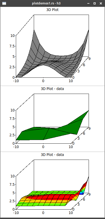
15. 3D Plot
Documentation on:
-
constructors - make_3d_plot and make_3d_plot_with_labels
-
struct - Tk3DPlot
![]() Example (incomplete) taken from "plotdemos1.rs":
Example (incomplete) taken from "plotdemos1.rs":
fn square(n: f64) -> f64 { n*n }
fn cowboyhat(x: f64, y: f64) -> f64 {
    let x1 = x/9.0;
    let y1 = y/9.0;

    3.0 * (1.0 - (square(x1) + square(y1))) * (1.0 - (square(x1) + square(y1)))
}

// upper plot in image below
fn canvas_10(root: &rstk::TkTopLevel) -> rstk::TkCanvas {
    let mut data: Vec<Vec<f64>> = vec![];
    for r in (-10..=10).step_by(2) {
        let r = r as f64;
        let mut row = vec![];

        for c in 0..=10 {
            let c = c as f64;
            row.push(cowboyhat(r, c));
        }
        data.push(row);
    }

    let canvas = make_white_canvas(root, 400, 300);

    let s = rstk::make_3d_plot(&canvas,
                               (0.0, 10.0, 3.0),
                               (-10.0, 10.0, 10.0),
                               (0.0, 10.0, 2.5));
    s.title("3D Plot", rstk::Justify::Centre);
    s.plot_data(&data);

    canvas
}

// -- lower plot in image below
fn canvas_12(root: &rstk::TkTopLevel) -> rstk::TkCanvas {
    let canvas = make_white_canvas(root, 400, 250);

    let s = rstk::make_3d_plot_with_labels(&canvas,
                                           (0.0, 10.0, 3.0),
                                           (-10.0, 10.0, 10.0),
                                           (0.0, 10.0, 2.5),
                                           &["A", "B", "C"]);
    s.title("3D Plot - data", rstk::Justify::Centre);
    s.colours("green", "black");
    s.interpolate_data(&[[1.0, 2.0, 1.0, 0.0],
                       [1.1, 3.0, 1.1, -0.5],
                       [3.0, 1.0, 4.0, 5.0]],
                       &[0.0, 0.5, 1.0, 1.5, 2.0]);
    canvas
}| Creates a 3D plot with given axes | |
| Uses a function to create an 11x11 array of values | |
| Interpolate colours the data, according to the given contours |
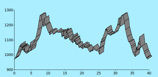
16. 3D Ribbon Plot
Documentation on:
-
constructor - make_3d_ribbon_plot
-
struct - Tk3DRibbonPlot
![]() Example taken from "plotdemos15.rs" - not complete code:
Example taken from "plotdemos15.rs" - not complete code:
let y_scale = (0.0, 40.0, 5.0);         // Y axis is miles along route
let z_scale = (900.0, 1300.0, 100.0);   // Z axis is altitude
// each duple is distance along route (Y) and its altitude (Z)
let yz = [
    ( 0.0,  971.0), ( 0.2,  977.0), ( 0.3,  981.0), ( 0.8, 1010.0), ( 1.0, 1022.0), ( 1.6, 1060.0),

  // SNIP 32 LINES!
];

let canvas2 = rstk::make_canvas(&root);
canvas2.width(800);
canvas2.height(400);
canvas2.background("#aaeeff");
canvas2.configure("border", "0");
canvas2.configure("highlightthickness", "0");
canvas2.pack().side(rstk::PackSide::Top).fill(rstk::PackFill::Both).expand(true).layout();

let s2 = rstk::make_3d_ribbon_plot(&canvas2, y_scale, z_scale);
s2.plot(&yz); | Creates the ribbon-plot using axis definitions for y and z | |
| Draws the ribbon, using values for y-z pairs |
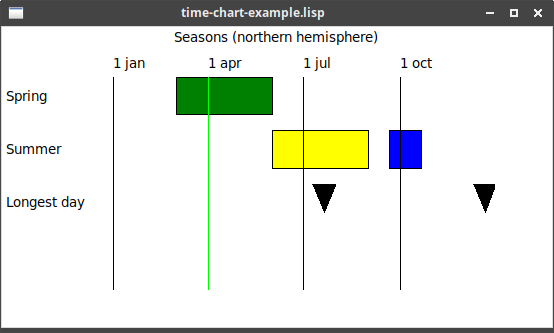
17. Time Chart
Documentation on:
-
constructor - make_time_chart
-
struct - TkTimeChart
After calling the above constructor, use a "builder" style to add options to
the chart, before calling plot to finally construct it. The options are defined in:
![]() Example taken from tcl "plotdemos7.tcl" ("time-chart-example.lisp"):
Example taken from tcl "plotdemos7.tcl" ("time-chart-example.lisp"):
let canvas = make_canvas(&root);
canvas.width(400);
canvas.height(200);
canvas.background("white");
canvas.grid().layout();

let s = rstk::make_time_chart(&canvas,
                              "1 january 2004",
                              "31 december 2004")
    .num_items(4)
    .plot();

s.period("Spring", ("1 march 2004", "1 june 2004"), "green");
s.period("Summer", ("1 june 2004", "1 september 2004"), "yellow");
s.add_period(("21 summer 2004", "21 october 2004"), "blue");
s.draw_line("1 jan", "1 january 2004", "black");
s.draw_line("1 mar", "1 april 2004", "black");
s.draw_line("1 jul", "1 july 2004", "black");
s.draw_line("1 oct", "1 october 2004", "black");
s.milestone("Longest day", "21 july 2004", "black");
s.add_milestone("21 december 2004", "black");

s.title("Seasons (northern hemisphere)", rstk::Justify::Centre);| Start/end times must be in appropriate format. | |
| A "period" is denoted as a filled rectangle, with given start/end times, and each period is on a new line with given label. | |
| Periods are added on to the previous period. | |
| Vertical lines are drawn using a time coordinate for the horizontal position. | |
| Milestones, like periods, are each put on a new line with given label. | |
| Adding a milestone adds it to the line of the previous milestone. |
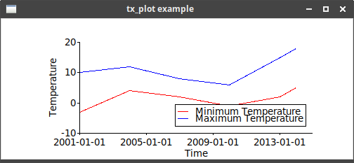
18. TX Plot
Documentation on:
After calling the above constructor, use a "builder" style to add options to
the chart, before calling plot to finally construct it. The options are defined in:
Once constructed, Tk’s "dataconfig" functions are replaced by methods in TkChartSeries.
![]() Example ("tx_plot.rs"):
Example ("tx_plot.rs"):
root.title("tx_plot example");

let canvas = rstk::make_canvas(&root);
canvas.width(500);
canvas.height(200);
canvas.background("white");
canvas.grid().layout();

let tx_plot = rstk::make_tx(&canvas,
                            ("2001-01-01", "2015-01-01", 1461),
                            (-10.0, 20.0, 10.0))
    .plot();

tx_plot.series_colour("min", "red");
tx_plot.series_colour("max", "blue");

tx_plot.x_title("Time");
tx_plot.v_title("Temperature");

tx_plot.legend_position(rstk::Position::BottomRight);
tx_plot.legend("min", "Minimum Temperature");
tx_plot.legend("max", "Maximum Temperature");

tx_plot.plot("min", ("2001-01-01", -3.0));
tx_plot.plot("min", ("2004-01-01", 4.0));
tx_plot.plot("min", ("2007-01-01", 2.0));
tx_plot.plot("min", ("2010-01-01", -1.0));
tx_plot.plot("min", ("2013-01-01", 2.0));
tx_plot.plot("min", ("2014-01-01", 5.0));

tx_plot.plot("max", ("2001-01-01", 10.0));
tx_plot.plot("max", ("2004-01-01", 12.0));
tx_plot.plot("max", ("2007-01-01", 8.0));
tx_plot.plot("max", ("2010-01-01", 6.0));
tx_plot.plot("max", ("2013-01-01", 15.0));
tx_plot.plot("max", ("2014-01-01", 18.0));| For tx-plot, the (min max step) are two dates and a time period | |
| Uses the generic functions to set up properties of the chart | |
| And the plot command takes a date as its first coordinate. |
19. XY Plot
There are five related charts:
-
xy-plotis the parent chart type, with four variants, depending on whether the axis value uses log -
strip-chartis a variant where the x-axis will grow if new points exceed the current bounds.
Documentation on:
-
constructors:
-
struct - TkXYPlot
The five chart types differ in appearance, but are all constructed in a similar way and have the same methods.
After calling the above constructors, use a "builder" style to add options to
the chart, before calling plot to finally construct it. The options are defined in:
Once constructed, Tk’s "dataconfig" functions are replaced by methods in TkChartSeries, and the "dotconfig" functions by TkChartDots
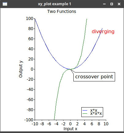
![]() Example ("xy_plot_1.rs"):
Example ("xy_plot_1.rs"):
root.title("xy_plot example 1");

let canvas = rstk::make_canvas(&root);
canvas.width(400);
canvas.height(400);
canvas.background("white");
canvas.grid().layout();

let xy = rstk::make_x_y(&canvas, (-10.0, 10.0, 2.0), (-100.0, 100.0, 20.0))
    .plot();
xy.title("Two Functions", rstk::Justify::Centre);
xy.x_title("Input x");
xy.v_title("Output y");
xy.series_colour("square", "blue");
xy.series_colour("cube", "green");

xy.legend_position(rstk::Position::BottomRight);
xy.legend("square", "x*x");
xy.legend("cube", "x*x*x");

for n in 0..20 {
    let i = (n-10) as f64;
    xy.plot("square", (i, i*i));
    xy.plot("cube", (i, i*i*i));
}

xy.balloon((0.0, 0.0), "crossover point", rstk::Direction::NorthWest);
xy.plaintext_colour("red");
xy.plaintext((6.0, 80.0), "diverging", rstk::Direction::NorthWest);
xy.save("xy-plot.ps");
| Create an xy-plot with x-axis [-10,10] and y-axis [-100,100] | |
| Use general functions to label the title and axes | |
series_CONFIG methods are used to set properties for the two lines |
|
| Set up the legend, to appropriately label each line | |
| Plot a given (x, y) item | |
| Add some text, pointing to location of the chart | |
| Change colour for plaintext | |
| … and display some text at given location | |
| Save the plot to a postscript file |
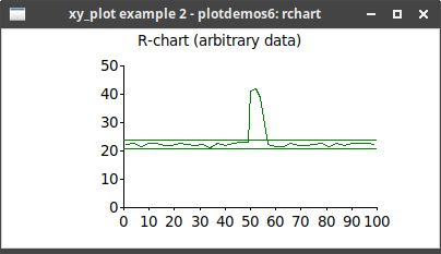
![]() Example of plotting using
Example of plotting using rchart - taken from "plotdemos6.rs":
// use rand::Rng; // uses the `rand` crate

root.title("xy_plot example 2 - plotdemos6: rchart");

let canvas = rstk::make_canvas(&root);
canvas.width(400);
canvas.height(200);
canvas.background("white");
canvas.grid().layout();

let chart = rstk::make_x_y(&canvas, (0.0, 100.0, 10.0), (0.0, 50.0, 10.0))
    .plot();
chart.title("R-chart (arbitrary data)", rstk::Justify::Centre);

chart.series_colour("series1", "green");
for x in (1..50).step_by(3) {
    let y = 20.0 + rand::thread_rng().gen_range(1.0..3.0);
    chart.rchart("series1", (x as f64, y));
}
// now some data outside the expected range
chart.rchart("series1", (50.0, 41.0));
chart.rchart("series1", (52.0, 42.0));
chart.rchart("series1", (54.0, 39.0));

// and continue with the well-behaved series
for x in (57..100).step_by(3) {
    let y = 20.0 + rand::thread_rng().gen_range(1.0..3.0);
    chart.rchart("series1", (x as f64, y));
}
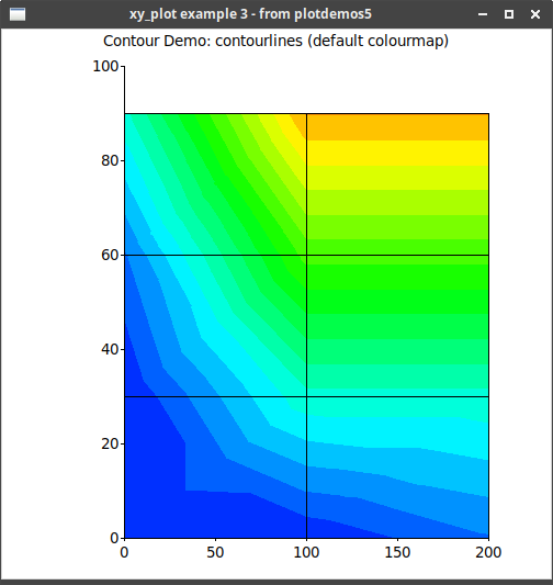
![]() Example of a contour plot - taken from "plotdemos5.rs":
Example of a contour plot - taken from "plotdemos5.rs":
root.title("xy_plot example 3 - from plotdemos5");

let canvas = rstk::make_canvas(&root);
canvas.width(500);
canvas.height(500);
canvas.background("white");
canvas.grid().layout();

let x = [
    [0.0, 100.0, 200.0],
    [0.0, 100.0, 200.0],
    [0.0, 100.0, 200.0],
    [0.0, 100.0, 200.0],
];
let y = [
    [0.0, 0.0, 0.0],
    [30.0, 30.0, 30.0],
    [60.0, 60.0, 60.0],
    [90.0, 90.0, 90.0],
];
let f = [
    [0.0, 1.0, 10.0],
    [0.0, 30.0, 30.0],
    [10.0, 60.0, 60.0],
    [30.0, 90.0, 90.0],
];
let contours = [
    0.0,
    5.2631578947,
    10.5263157895,
    15.7894736842,
    21.0526315789,
    26.3157894737,
    31.5789473684,
    36.8421052632,
    42.1052631579,
    47.3684210526,
    52.6315789474,
    57.8947368421,
    63.1578947368,
    68.4210526316,
    73.6842105263,
    78.9473684211,
    84.2105263158,
    89.4736842105,
    94.7368421053,
    100.0,
    105.263157895,
];
let x_limits = (0.0, 200.0, 50.0);
let y_limits = (0.0, 100.0, 20.0);

let chart = rstk::make_x_y(&canvas, x_limits, y_limits).plot();
chart.title(
    "Contour Demo: contourlines (default colourmap)",
    rstk::Justify::Centre,
);
chart.draw_contour_fill(&x, &y, &f, &contours);
chart.draw_grid(&x, &y);
x y f define the (x, y) point and its value. contours defines the
boundaries between the colours. |