Provides RSTK (Rust/Tk) examples for the tkdocs tutorial.
Sections are named after the equivalent tkdocs section, include a link to the original section for reading, and then example rust code and screenshots. There is little additional explanation, except for some comments on the example code.
-
download "rstk-examples.zip" from latest version
Only a subset of what is available is illustrated here - more information is available for rstk and in the Tk documentation.
This document and its examples builds on the tkdocs
tutorial by Mark Roseman, and has the same license:

1. Introduction
Read introduction.
2. Installing Tk
Read installing Tk or follow the information on the rstk page.
All of the examples here (and more) are available for download from the link above; the filename is given for each example. After unzipping the archive, the structure is:
$ tree .
.
├── Cargo.toml
├── examples
│   ├── binding-example.rs
│   ├── button-example.rs
|   ... etc
For example, to run the button example, use:
$ cargo run --example button-example
The "rstk" crate will be installed when you run your first example.
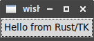
2.1. The Obligatory First Program
 Example (available in the examples directory as "hello.rs"):
use rstk::*;  fn main() {
let root = rstk::start_wish().unwrap();
fn main() {
let root = rstk::start_wish().unwrap();  let button = rstk::make_button(&root);
  button.text("Hello from Rust/TK");
  button.grid().layout();
  rstk::mainloop();
  }
} |
States that we are using the rstk package - notice the asterisk, it is important to use the traits as well as the functions etc. |
|
Starts the rstk connection with the tk program - must be called first,
and returns a Result containing the root window, into which the other
widgets can be placed. You may want to handle the error case, if the
given "wish" program is not available, in a more user-friendly way. |
|
Creates an example of a button widget, placed in the root window. |
|
Sets the text on the button widget. |
|
Arranges the given widget in its parent using a grid layout. |
|
Starts the gui-mainloop, waiting for and responding to gui events. |
To specify a particular tk program, replace the line labelled "2" with:
let root = rstk::start_with("tclkit.exe").unwrap();2.1.1. Running the program
Run the program as an example from cargo using:
$ cargo run --example hello
And see the window open:
3. A First (Real) Example
Read a first example.
|
To save some repetition, examples written without main will assume the following template: |
use rstk::*;

fn main() {
    let root = rstk::start_wish().unwrap();

    // PASTE THE EXAMPLE HERE

    rstk::mainloop();
} |
Replace this comment with the example code. |
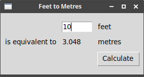
Example ("first-example.rs"):
root.title("Feet to Metres");
let content = rstk::make_frame(&root);
content.padding(&[3, 3, 12, 12]);
content.grid()
.column(0)
.row(0)
.sticky(rstk::Sticky::NESW)
.layout();
root.grid_configure_column(0, "weight", "1");
root.grid_configure_row(0, "weight", "1");
// top row has the entry widget and explanatory label to its right
let feet_entry = rstk::make_entry(&content);
feet_entry.width(7);
feet_entry.grid().column(2).row(1).sticky(rstk::Sticky::EW).padx(5).pady(5)
.layout();
let feet_label = rstk::make_label(&content);
feet_label.text("feet");
feet_label.grid().column(3).row(1).sticky(rstk::Sticky::W).padx(5).pady(5).layout();
// middle row has three labels
let desc_label = rstk::make_label(&content);
desc_label.text("is equivalent to");
desc_label.grid().column(1).row(2).sticky(rstk::Sticky::E).padx(5).pady(5).layout();
let result_label = rstk::make_label(&content);
result_label.text("");
result_label.grid().column(2).row(2).sticky(rstk::Sticky::EW).padx(5).pady(5).layout();
let metres_label = rstk::make_label(&content);
metres_label.text("metres");
metres_label.grid().column(3).row(2).sticky(rstk::Sticky::EW).padx(5).pady(5).layout();
let calculate = {
let feet_entry = feet_entry.clone();
move || {
let entry_value = feet_entry.value_get();  if let Ok(feet) = entry_value.parse::<f32>() {
let metres = (0.3048 * feet * 10000.0) / 10000.0;
result_label.text(&format!("{:.5}", metres.to_string()));
}
}
};
// last row has the button on right
let calc_button = rstk::make_button(&content);
calc_button.text("Calculate");
calc_button.command(calculate.clone());
if let Ok(feet) = entry_value.parse::<f32>() {
let metres = (0.3048 * feet * 10000.0) / 10000.0;
result_label.text(&format!("{:.5}", metres.to_string()));
}
}
};
// last row has the button on right
let calc_button = rstk::make_button(&content);
calc_button.text("Calculate");
calc_button.command(calculate.clone());  calc_button.grid().column(3).row(3).sticky(rstk::Sticky::W).padx(5).pady(5).layout();
feet_entry.focus();
calc_button.grid().column(3).row(3).sticky(rstk::Sticky::W).padx(5).pady(5).layout();
feet_entry.focus();  root.bind("<Return>", move |_| { calculate(); } );
|
Set title of root window. |
|
Creates the inner-frame, to hold our window content. Note that parent is
assumed to be the root window, if not given. |
|
These lines place the frame in the window, and ensure it expands to fill the whole root window. The "padding" gives some space around the edges. |
|
Create the "entry" widget to enter the number of feet: the widget is created "in"
the content frame. The later call to grid will arrange it within
its container. |
|
Here we place the widget in the container, at an appropriate row/column. |
|
Make clone of feet_entry, to move into the calculate function. |
|
Reads the current value of the entry widget. |
|
The command method is used to set the button to call calculate when it is
clicked. The function is cloned, so we can also use it with the "Return" key. |
|
Give the entry field focus. |
|
Binds the "Return" key to the calculate function, so pressing return will
re-calculate the value. Here, we ignore the "event" argument value. |
4. Tk Concepts
Read Tk concepts.
4.1. Creating widgets in rstk
All widgets are created through rstk using a make_WIDGET function. This
function returns an instance of a struct which holds … only a string id (or
two), which is the unique global name used to refer to that Tk widget within
the wish shell.
|
Feel free to clone or otherwise duplicate the rstk struct value - each clone will refer to the same unique Tk widget. This is useful when, e.g., having to refer to the same label from different functions to update its value. |
Most widgets implement the TkWidget trait.
This trait includes some functions providing access to low-level Tk functions,
such as winfo and configure. In addition, some functions, like mouse_position
provide more convenient, and type-safe, access to the same information.
4.2. Binding to events
There are two versions of bind, one applying to all widgets and
one to a specific widget:
bind(event_pattern: &str, function: impl fn(TkEvent)→())
Binds the event_pattern in all parts of your application - in Tk terms, it uses the bind tag "all".
bind(&self, event_pattern: &str, function: impl fn(TkEvent)→())
-
self- the widget to bind the event to -
event_pattern- the event pattern to bind -
function- a function which accepts a single parameter, the event.
The event passed to the function is a struct (TkEvent) instance, with the
following fields (see manual for
more information on each):
-
x- x-coord, in the widget, of the event -
y- y-coord, in the widget, of the event -
root_x- x-coord, relative to screen, of the event -
root_y- y-coord, relative to screen, of the event -
width- used in "configure" events, specifying width -
height- used in "configure" events, specifying height -
key_code- for keycode events, gives the keycode used to trigger the event -
key_symbol- ("keysym" in tk), gives the key symbol used to trigger the event -
mouse_button- ("button" in tk), gives the mouse button number used to trigger the event
Example ("binding-example.rs") of binding to some typical mouse
events. Rust requires some cloning of the original label!
let label = rstk::make_label(&root);
label.text("Starting ...");
label.grid().padx(10).pady(10).layout();

{
    let labelc = label.clone();
    label.bind("<Enter>", move |_| { labelc.text("Moved mouse inside"); });
}
{
    let labelc = label.clone();
    label.bind("<Leave>", move |_| { labelc.text("Moved mouse outside"); });
}
{
    let labelc = label.clone();
    label.bind("<ButtonPress-1>", move |_| { labelc.text("Clicked left mouse button"); });
}
{
    let labelc = label.clone();
    label.bind("<3>", move |_| { labelc.text("Clicked right mouse button"); });
}
{
    let labelc = label.clone();
    label.bind("<Double-1>", move |_| { labelc.text("Double clicked"); });
}
label.clone().bind("<B3-Motion>",
                   move |event| {
                       label.text(&format!("Right button drag to {} {}",
                                          event.x, event.y));
                   });
5. Basic Widgets
Read basic widgets.
|
|
The tkdocs examples often refer to tying a tk-widget to a variable: as the value of the tk-widget changes, so does the value in the variable. rstk does not support this, and so widgets must be directly queried for their values. |
5.1. Frame
Documentation on:
-
constructor - make_frame
-
struct - TkFrame
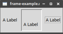
Example ("frame-example.rs"):
root.title("frame-example.rs");

let frame_1 = rstk::make_frame(&root);
let frame_2 = rstk::make_frame(&root);
frame_2.border_width(2);
frame_2.relief(rstk::Relief::Sunken);
let frame_3 = rstk::make_frame(&root);
frame_3.border_width(2);
frame_3.relief(rstk::Relief::Groove);

frame_1.grid().row(0).column(0).padx(5).pady(5).layout();
frame_2.grid().row(0).column(1).padx(5).pady(5).layout();
frame_3.grid().row(0).column(2).padx(5).pady(5).layout();

frame_1.padding(&[2]);
frame_2.padding(&[5, 40, 10, 10]);

let label_1 = rstk::make_label(&frame_1);
label_1.text("A Label");
label_1.grid().layout();

let label_2 = rstk::make_label(&frame_2);
label_2.text("A Label");
label_2.grid().layout();

let label_3 = rstk::make_label(&frame_3);
label_3.text("A Label");
label_3.grid().layout(); |
Empty frame. |
|
Frame with border and relief settings. |
|
Apply some interior padding to the frames. |
When displayed, we can see the impact of the border/relief settings, and also how the interior padding affects the position of the label:
5.2. Label
Documentation on:
-
constructor - make_label
-
struct - TkLabel
This example uses a font and image: for more on those topics see Fonts, Colours, Images.
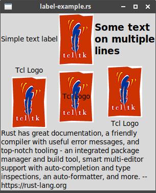
Example ("label-example.rs"):
root.title("label-example.rs");
let label_1 = rstk::make_label(&root);
label_1.text("Simple text label");

let image = rstk::read_image("examples/tcllogo.gif");

let label_2 = rstk::make_label(&root);
label_2.image(&image);

let label_3 = rstk::make_label(&root);
label_3.font(&rstk::TkFont {
    family: String::from("Helvetica"),
    size: 14,
    weight: rstk::Weight::Bold,
    ..Default::default()
});
label_3.text("Some text\non multiple\nlines");

let label_4 = rstk::make_label(&root);
label_4.image(&image);
label_4.text("Tcl Logo");

let label_5 = rstk::make_label(&root);
label_5.image(&image);
label_5.text("Tcl Logo");

let label_6 = rstk::make_label(&root);
label_6.image(&image);
label_6.text("Tcl Logo");

let text = "Rust has great documentation, a friendly compiler with useful error messages, and top-notch tooling - an integrated package manager and build tool, smart multi-editor support with auto-completion and type inspections, an auto-formatter, and more. -- https://rust-lang.org";

let label_7 = rstk::make_label(&root);
label_7.text(text);
label_7.wrap_length(300);

label_4.compound(rstk::Compound::Bottom);
label_5.compound(rstk::Compound::Centre);
label_6.compound(rstk::Compound::Top);

label_1.grid().row(0).column(0).layout();
label_2.grid().row(0).column(1).layout();
label_3.grid().row(0).column(2).layout();
label_4.grid().row(1).column(0).layout();
label_5.grid().row(1).column(1).layout();
label_6.grid().row(1).column(2).layout();
label_7.grid().row(2).column(0).column_span(3).sticky(rstk::Sticky::NESW).layout(); |
Label with text |
|
Label with image |
|
Label with multi-line text and a font definition, to change how the text is
displayed. |
|
Labels can be created with both an image and text, but see <6>. |
|
Longer text labels can be wrapped, using wrap_length to set the line
width, here in pixels. |
|
To display both image and text, use the compound setting. |
The compound setting controls which of the image and text are displayed, and how
they are arranged. The possible values are:
-
text- text only -
image- image only -
centre,center- text centred on the image -
top,bottom,left,right- position of image relative to text -
none- shows image if present, otherwise the text
The second row of the example illustrates three arrangements of the image and text.
5.3. Button
Documentation on:
-
constructor - make_button
-
struct - TkButton
Example ("button-example.rs"):
root.title("button-example.rs");

let button_1 = rstk::make_button(&root);
button_1.text("Simple text label");
button_1.command(|| { println!("Button-1"); });

let image = rstk::read_image("examples/tcllogo.gif");

let button_2 = rstk::make_button(&root);
button_2.image(&image);
button_2.command(|| { println!("Button-2"); });

let button_3 = rstk::make_button(&root);
button_3.image(&image);
button_3.text("Tcl Logo");
button_3.command(|| { println!("Button-3"); });

button_3.compound(rstk::Compound::Bottom);
button_1.state(rstk::State::Disabled);

button_1.grid().row(0).column(0).layout();
button_2.grid().row(0).column(1).layout();
button_3.grid().row(0).column(2).layout();

rstk::bind("<Return>", move |_| { button_2.invoke(); }); |
Simple button with text label |
|
Button with text and image … |
|
… which must be configured to display both. |
|
The state may be normal or disabled. |
|
The command of a button can be called directly, e.g. to set up a default action. |
5.4. Checkbutton
Documentation on:
-
constructor - make_check_button
-
struct - TkCheckButton
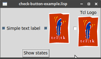
Example ("check-button-example.rs"):
root.title("check-button-example.rs");

let button_1 = rstk::make_check_button(&root);
button_1.text("Simple text label");
button_1.command(|value| { println!("Button-1 now {}", value); });

let image = rstk::read_image("examples/tcllogo.gif");
let button_2 = rstk::make_check_button(&root);
button_2.image(&image);
button_2.command(|value| { println!("Button-2 now {}", value); });

let button_3 = rstk::make_check_button(&root);
button_3.image(&image);
button_3.text("Tcl Logo");
button_3.command(|value| { println!("Button-3 now {}", value); });

let show = rstk::make_check_button(&root);
show.text("Show states");
{
    let button_1 = button_1.clone();
    let button_2 = button_2.clone();
    let button_3 = button_3.clone();

    show.command(move || { println!("Buttons now {} {} {}",
                                    button_1.is_selected(),
                                    button_2.is_selected(),
                                    button_3.is_selected() )
    });
}

button_1.selected(true);
button_3.compound(rstk::Compound::Bottom);

button_1.grid().row(0).column(0).padx(5).pady(5).layout();
button_2.grid().row(0).column(1).padx(5).pady(5).layout();
button_3.grid().row(0).column(2).padx(5).pady(5).layout();
show.grid().row(1).column_span(3).layout(); |
The set up is the same as for a button, except the command now receives
the current check-button value (true/false). |
|
Because of Rust’s borrow-checker, we need to make clones of the button references to use within a command closure: clones are cheap, and all clones refer to the same underlying widget. |
|
is_selected retrieves the check-button’s state, as true/false. |
|
selected sets the check-button’s state, as true/false. |
5.5. Radiobutton
Documentation on:
-
constructor - make_radio_button
-
struct - TkRadioButton
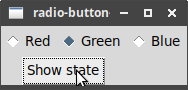
Example ("radio-button-example.rs"):
root.title("radio-button-example.rs");

let button_1 = rstk::make_radio_button(&root, "colours", "red");
button_1.text("Red");
let button_2 = rstk::make_radio_button(&root, "colours", "green");
button_2.text("Green");
let button_3 = rstk::make_radio_button(&root, "colours", "blue");
button_3.text("Blue");

button_1.grid().column(0).row(0).padx(5).pady(5).layout();
button_2.grid().column(1).row(0).padx(5).pady(5).layout();
button_3.grid().column(2).row(0).padx(5).pady(5).layout();
button_3.value("green");

let show_button = rstk::make_button(&root);
show_button.text("Show state");
show_button.command(move || {
    println!("Colour: {}", button_3.value_get());
});

show_button.grid().column(0).row(1).column_span(3).layout(); |
Radio buttons are created with a required "group" and "value". All radio buttons in a group have the same group name, "colours" in this case, but each has a distinct value. |
|
The value of the group can be set using value: setting the
value on one button in the group affects the whole group equally. |
|
The value of the selected radio-button is retrieved using value_get:
all buttons in the group return the same value. |
5.6. Entry
Documentation on:
-
constructor - make_entry
-
struct - TkEntry
Example ("entry-example.rs"):
root.title("entry-example.rs");

let entry_1 = rstk::make_entry(&root);
let entry_2 = rstk::make_entry(&root);
entry_2.show('*');

let name_label = rstk::make_label(&root);
name_label.text("Name:");
name_label.grid().row(0).column(0).layout();
entry_1.grid().row(0).column(1).pady(5).layout();

let password_label = rstk::make_label(&root);
password_label.text("Password:");
password_label.grid().row(1).column(0).layout();
entry_2.grid().row(1).column(1).pady(5).layout();

let show_button = rstk::make_button(&root);
show_button.text("Show entries");
show_button.command(move || {
    println!("{} - {}", entry_1.value_get(), entry_2.value_get());
});
show_button.grid().row(2).column(0).column_span(2).layout(); |
Creates a standard "entry" widget |
|
Creates an "entry" widget suitable for entering passwords |
|
value_get retrieves the text entered into the "entry" widget |
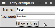
After typing a few things and clicking "Show entries":
$ cargo run --example label-example
Peter - random
The password "random" is hidden behind asterisks in the display, but the actual text is retrieved from the widget.
|
rstk currently does not support "validatecommand". |
5.7. Combobox
Documentation on:
-
constructor - make_combobox
-
struct - TkCombobox
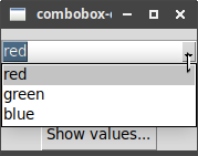
Example ("combobox-example.rs"):
root.title("combobox-example.rs");

let cb1 = rstk::make_combobox(&root, &["red", "green", "blue"]);
let cb2 = rstk::make_combobox(&root, &["red", "green", "blue"]);
cb2.state(rstk::State::Readonly);

cb1.grid().row(0).column(0).pady(10).layout();
cb2.grid().row(1).column(0).pady(10).layout();

{
    let cb2c = cb2.clone();
    cb2.bind("<<ComboboxSelected>>",
             move |_| { println!("cb2 is now {}", cb2c.value_get()); });
}

let show_values = rstk::make_button(&root);
show_values.text("Show values...");
show_values.command(move || {
    println!("{} and {}", cb1.value_get(), cb2.value_get())
});
show_values.grid().row(2).column(0).layout(); |
Creates instances of combo-boxes, with a preset list of values. |
|
Binds the "ComboboxSelected" event, to respond whenever a new item is chosen from the list. |
|
Current value can be retrieved directly from the combobox. |
6. The Grid Geometry Manager
The basic grid layout is constructed using a rust-style "builder" pattern.
Step 1: signal that you want to layout a widget using a grid, so obtaining an instance of a GridLayout struct:
widget.grid()Step 2: use the "builder" functions to set the various configuration options in the struct.
Step 3: finish the layout, using layout:
widget.grid()
  .OPTION(VALUE) // 0 or more
  .layout();
See GridLayout for list of builder functions.
Each widget that can be included in a grid layout implements the trait TkGridLayout with options for controlling the grid.
6.1. Example
(Corresponding to the combined example in the Padding subsection.)
Example ("grid-example.rs"):
root.title("grid-example.rs");

// first, make some widgets and parent frames
let content = rstk::make_frame(&root);
let frame = rstk::make_frame(&content);
frame.border_width(5);
frame.relief(rstk::Relief::Ridge);
frame.width(200);
frame.height(100);

let name_label = rstk::make_label(&content);
name_label.text("Name");

let name = rstk::make_entry(&content);
let cb_1 = rstk::make_check_button(&content);
cb_1.text("One");
let cb_2 = rstk::make_check_button(&content);
cb_2.text("Two");
let cb_3 = rstk::make_check_button(&content);
cb_3.text("Three");
let ok = rstk::make_button(&content);
ok.text("OK");
let cancel = rstk::make_button(&content);
cancel.text("Cancel");

// -- some adjustments to the widgets/frames

content.padding(&[3, 3, 12, 12]);
cb_1.selected(true);
cb_2.selected(false);
cb_3.selected(true);

// -- layout the widgets in the grid
content.grid().sticky(rstk::Sticky::NESW).layout();
frame.grid().column_span(3).row_span(2).sticky(rstk::Sticky::NESW)
  .layout();
name_label.grid().row(0).column(3).column_span(2)
  .sticky(rstk::Sticky::NW).padx(5).layout();
name.grid().row(1).column(3).column_span(2).sticky(rstk::Sticky::NEW)
  .pady(5).padx(5).layout();
cb_1.grid().row(3).column(0).layout();
cb_2.grid().row(3).column(1).layout();
cb_3.grid().row(3).column(2).layout();
ok.grid().row(3).column(3).layout();
cancel.grid().row(3).column(4).layout();

// -- tidy up the layout and resizing properties
root.grid_configure_column(0, "weight", "1");
root.grid_configure_row(0, "weight", "1");
content.grid_configure_column(0, "weight", "3");
content.grid_configure_column(1, "weight", "3");
content.grid_configure_column(2, "weight", "3");
content.grid_configure_column(3, "weight", "1");
content.grid_configure_column(4, "weight", "1");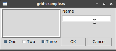
content.grid_configure_row(1, "weight", "1"); |
The "content" frame fills the entire top-level window. |
|
The "frame" frame spans 3 columns and 2 rows, and sits in the top-left corner. |
|
The "name_label" is in the first row, last column, and spans two columns. |
|
Try commenting out this and the following lines, and see the difference in behaviour when resizing the window. |
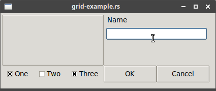
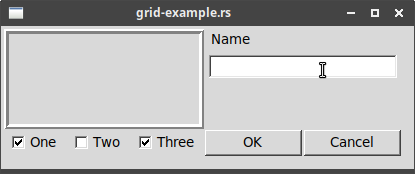
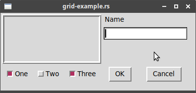
The final layout:
7. More Widgets
Read more widgets.
7.1. Listbox
Documentation on:
-
constructor - make_listbox
-
struct - TkListbox
Example ("listbox-example.rs"):
use rstk::*;

const COUNTRY_CODES: &[&str] = &[
    "ar", "au", "be", " br", "ca", "cn", "dk", "fi", "fr", "gr", "in", "it",
    "jp", "mx", "nl", "no", "es", "se", "ch"
];

const COUNTRY_NAMES: &[&str] = &[
    "Argentina", "Australia", "Belgium", "Brazil", "Canada", "China",
    "Denmark", "Finland", "France", "Greece", "India", "Italy",
    "Japan", "Mexico", "Netherlands", "Norway", "Spain", "Sweden",
    "Switzerland"
];

const COUNTRY_POPN: &[u32] = &[
    41000000, 21179211, 10584534, 185971537,
    33148682, 1323128240, 5457415, 5302000,
    64102140, 11147000, 1131043000, 59206382,
    127718000, 106535000, 16402414, 4738085,
    45116894, 9174082, 7508700
];

fn gift_name(gift: &str) -> String {
    match gift {
        "card" => String::from("Greeting Card"),
        "flowers" => String::from("Flowers"),
        "nastygram" => String::from("Nastygram"),
        _ => String::from("Nothing"),
    }
}

fn send_gift(selection: &[u32],
             gift: &str,
             sent_label: &rstk::TkLabel) {
    if selection.len() == 1 {
        let index = selection[0] as usize;
        let country = COUNTRY_NAMES[index];
        let gift = gift_name(gift);

        sent_label.text(&format!("Sent {} to leader of {}", &gift, country));
    }
}

fn show_population(selection: &[u32],
                   status_label: &rstk::TkLabel,
                   sent_label: &rstk::TkLabel) {
    if selection.len() == 1 {
        let index = selection[0] as usize;
        let code = COUNTRY_CODES[index];
        let name = COUNTRY_NAMES[index];
        let popn = COUNTRY_POPN[index];

        status_label.text(&format!("The population of {} ({}) is {}",
        name, code, popn));
        sent_label.text("");
    }
}

fn main() {
    let root = rstk::start_wish().unwrap();

    root.title("Listbox Example: Gift Sending");
    // - outer content frame and widgets
    let content = rstk::make_frame(&root);
    let countries = rstk::make_listbox(&root, &COUNTRY_NAMES);
    let send_label = rstk::make_label(&root);
    send_label.text("Send to country's leader:");
    let gift_1 = rstk::make_radio_button(&root, "gift", "card");
    gift_1.text(&gift_name("card"));
    let gift_2 = rstk::make_radio_button(&root, "gift", "flowers");
    gift_2.text(&gift_name("flowers"));
    let gift_3 = rstk::make_radio_button(&root, "gift", "nastygram");
    gift_3.text(&gift_name("nastygram"));
    let sent_label = rstk::make_label(&root);
    sent_label.anchor(rstk::Anchor::Centre);
    let status_label = rstk::make_label(&root);
    status_label.anchor(rstk::Anchor::W);
    let send = rstk::make_button(&root);
    send.text("Send Gift");

    {
        let countries = countries.clone();
        let gift_1 = gift_1.clone();
        let sent_label = sent_label.clone();
        send.command(move || {
            send_gift(&countries.selected_items(),
                      &gift_1.value_get(), &sent_label);
        });
    }

    // - grid the outer content frame
    content.padding(&[5, 5, 12, 0]);
    content.grid().column(0).row(0)
        .sticky(rstk::Sticky::NESW).layout();
    root.grid_configure_column(0, "weight", "1");
    root.grid_configure_row(0, "weight", "1");
    content.grid_configure_column(0, "weight", "1");
    content.grid_configure_row(0, "weight", "1");
    // - grid the other widgets
    countries.grid().row(0).column(0).row_span(6)
        .sticky(rstk::Sticky::NESW).layout();
    send_label.grid().row(0).column(1).padx(10).pady(10).layout();
    gift_1.grid().row(1).column(1).sticky(rstk::Sticky::W).padx(20).layout();
    gift_2.grid().row(2).column(1).sticky(rstk::Sticky::W).padx(20).layout();
    gift_3.grid().row(3).column(1).sticky(rstk::Sticky::W).padx(20).layout();
    send.grid().row(4).column(2).padx(10).sticky(rstk::Sticky::E).layout();
    sent_label.grid().row(5).column(1).column_span(2)
        .padx(5).pady(5).sticky(rstk::Sticky::N).layout();
    status_label.grid().row(6).column(0).column_span(2)
        .sticky(rstk::Sticky::EW).layout();

    gift_1.value("card");
    show_population(&countries.selected_items(), &status_label, &sent_label);

    // - alternate colours in listbox
    for i in 0..COUNTRY_NAMES.len() {
        if i % 2 == 0 {
            countries.item_configure(i as u32, "background", "#f0f0ff");
        }
    }

    // - set event bindings for when selection in listbox changes,
    // when user double-clicks ths list, and when they hit the Return key.
    {
        let countriesc = countries.clone();
        let sent_label = sent_label.clone();
        countries.bind("<<ListboxSelect>>", move |_| {
            show_population(&countriesc.selected_items(), &status_label, &sent_label);
        });
    }
    {
        let countriesc = countries.clone();
        let gift_1 = gift_1.clone();
        let sent_label = sent_label.clone();
        countries.bind("<Double-1>", move |_| {
            send_gift(&countriesc.selected_items(), &gift_1.value_get(), &sent_label);
        });
    }
    {
        let countries = countries.clone();
        let gift_1 = gift_1.clone();
        let sent_label = sent_label.clone();
        root.bind("<Return>", move |_| {
            send_gift(&countries.selected_items(), &gift_1.value_get(), &sent_label);
        });
    }

    rstk::mainloop();
} |
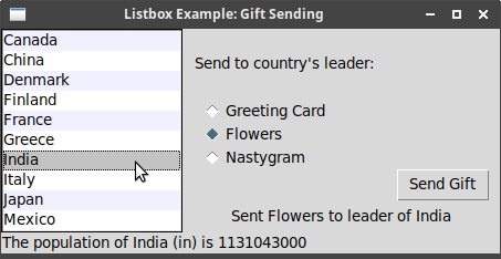
Creates a listbox with list of country names. |
|
Retrieves a list of the selected indices. |
|
Configures alternative items to set their background colour. |
7.2. Scrollbar
Documentation on:
-
constructors - make_horizontal_scrollbar and make_vertical_scrollbar
-
struct - TkScrollbar
This example shows how to use the stand-alone scrollbar
("scrollbar-example.rs"). Unlike Tk, rstk requires the widget to be scrolled to
be passed to the constructor for the scrollbar, as well as the parent pane.
This simplifies the construction logic:
root.title("scrollbar-example.rs");
let listbox = rstk::make_listbox(&root, &[]);
listbox.height(5);

for i in 1..=100 {
    listbox.append(&format!("Line {} of 100", i));
}

let scrollbar = rstk::make_vertical_scrollbar(&root, &listbox);
let status = rstk::make_label(&root);
status.text("Status message here");

listbox.grid().column(0).row(0).sticky(rstk::Sticky::NESW).layout();
scrollbar.grid().column(1).row(0).sticky(rstk::Sticky::NS).layout();
status.grid().column(0).row(1).column_span(2)
    .sticky(rstk::Sticky::EW).layout();

root.grid_configure_column(0, "weight", "1");
root.grid_configure_row(0, "weight", "1"); |
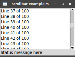
The constructor automatically associates the vertical scrollbar with the listbox. |
|
We only have to position the scrollbar beside the listbox. |
7.3. Text
Documentation on:
Example of an editable and a readonly text widget
("text-example-1.rs"):
use rstk::*;

const TEXT: &str = "Rust has great documentation, a friendly compiler with useful error messages, and top-notch tooling - an integrated package manager and build tool, smart multi-editor support with auto-completion and type inspections, an auto-formatter, and more. -- https://rust-lang.org";

fn main() {
    let root = rstk::start_wish().unwrap();

    root.title("text-example-1.rs");
    root.grid_configure_column(0, "weight", "1");
    root.grid_configure_row(0, "weight", "1");

    let text_1 = rstk::make_text(&root);
    text_1.width(30);
    text_1.height(20);
    text_1.insert_end(&TEXT);
    text_1.wrap(rstk::Wrapping::Word);
    text_1.grid().row(0).column(0).sticky(rstk::Sticky::NESW).layout();

    let text_2 = rstk::make_text(&root);
    text_2.width(30);
    text_2.height(20);
    text_2.insert_end(&TEXT);
    text_2.state(rstk::State::Disabled);
    text_2.grid().row(0).column(1).sticky(rstk::Sticky::NESW).layout();

    rstk::mainloop();
} |
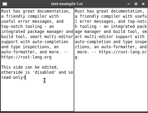
The quote is added by appending to the text display. |
|
First text widget is set to wrap on words. |
|
Sets the second text widget to be readonly. |
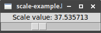
7.4. Scale
Documentation on:
-
constructor - make_scale
-
struct - TkScale
Example ("scale-example.rs"):
root.title("scale-example.rs");

let label = rstk::make_label(&root);
label.text("Scale value: 20");

label.grid().row(0).layout();

let scale = rstk::make_scale(&root, rstk::Orientation::Horizontal);
scale.length(200);
scale.from(1.0);
scale.to(100.0);
scale.command(move |value| {
    label.text(&format!("Scale value: {}", value));
});

scale.grid().row(1).sticky(rstk::Sticky::EW).layout();

scale.value(20.0); |
Sets up a scale, with range 1 to 100, with given pixel length and orientation. |
|
The command accepts the current scale value, so we can set an external variable/label with the updated value. |
|
value is used to set the value of the scale widget. |
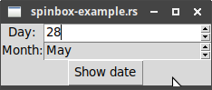
7.5. Spinbox
Documentation on:
-
constructors - make_spinbox_range and make_spinbox_values
-
struct - TkSpinboxRange and TkSpinboxValues
There are two kinds of spinboxes, separated here: the first works with ranges of numbers, and the second with a list of values.
Example ("spinbox-example.rs"):
root.title("spinbox-example.rs");

let days = rstk::make_spinbox_range(&root, 1.0, 31.0, 1.0);
let months = rstk::make_spinbox_values(&root, &["January", "February",
                                       "March", "April", "May", "June",
                                       "July", "August", "September",
                                       "October", "November", "December"]);
months.state(rstk::State::Readonly);
let show_date = rstk::make_button(&root);
show_date.text("Show date");

let day_label = rstk::make_label(&root);
day_label.text("Day:");
day_label.grid().column(0).row(0).layout();
days.grid().column(1).row(0).sticky(rstk::Sticky::EW).layout();

let month_label = rstk::make_label(&root);
month_label.text("Month:");
month_label.grid().column(0).row(1).layout();
months.grid().column(1).row(1).sticky(rstk::Sticky::EW).layout();

show_date.grid().column(0).row(2).column_span(2).layout();
show_date.command(move || {
    println!("Date {} {}", days.value_get(), months.value_get());
}); |
Creates spinbox with range of numbers. |
|
Creates spinbox from list of string values. |
|
Setting the state to readonly forces user to pick from list of
values, instead of entering their own value. |
|
value_get is the accessor method to retrieve values from the spinbox. |
7.6. Progressbar
Documentation on:
-
constructor - make_progress_bar
-
struct - TkProgressBar
Example ("progressbar-example.rs"):
root.title("progressbar-example.rs");

let bar_1 = rstk::make_progressbar(&root,
                                   rstk::Orientation::Horizontal,
                                   rstk::ProgressMode::Determinate);
bar_1.length(100);
bar_1.value(50.0);
bar_1.grid().row(0).column(0).padx(5).pady(5).layout();

let bar_2 = rstk::make_progressbar(&root,
                                   rstk::Orientation::Vertical,
                                   rstk::ProgressMode::Determinate);
bar_2.length(200);
bar_2.value(80.0);
bar_2.grid().row(0).column(1).row_span(2).padx(5).pady(5).layout();

let bar_3 = rstk::make_progressbar(&root,
                                   rstk::Orientation::Horizontal,
                                   rstk::ProgressMode::Indeterminate);
bar_3.length(100);
bar_3.grid().row(1).column(0).padx(5).pady(5).layout();

bar_3.start(10); |
Sets value on horizontal progressbar to 50% |
|
Sets value on vertical progressbar to 80% |
|
Starts the indeterminate progressbar with updates every 10ms |
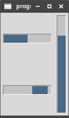
The static image freezes the side-to-side motion of the lower-left progressbar.
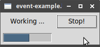
8. Event Loop
Read event loop.
"after" is supported in rstk.
The "One Step at a Time" example ("event-example.rs"):
use rstk::*;
use std::sync::Arc;
use std::sync::Mutex;

fn result(answer: i32,
          interrupt: Arc<Mutex<bool>>,
          progressbar: rstk::TkProgressbar,
          button: rstk::TkButton,
          label: rstk::TkLabel) {
    progressbar.value(0.0);
    if answer >= 0 {
        label.text(&format!("Answer {}", answer));
    } else {
        label.text("No answer");
    }
    button.text("Start!");
    button.clone().command(move || {
        start(interrupt.clone(), progressbar.clone(), button.clone(), label.clone());
    });
}

fn start(interrupt: Arc<Mutex<bool>>,
         progressbar: rstk::TkProgressbar,
         button: rstk::TkButton,
         label: rstk::TkLabel) {
    button.text("Stop!");
    {
        let interrupt = interrupt.clone();
        button.clone().command(move || { stop(interrupt.clone()); });
    }
    label.text("Working ...");
    let mut interruptv = interrupt.lock().unwrap();
    *interruptv = false;

    {
        let interrupt = interrupt.clone();
        rstk::after(1, move || {
            step(0.0, interrupt.clone(), progressbar.clone(), button.clone(), label.clone());
        });
    }
}

fn step(count: f32,
        interrupt: Arc<Mutex<bool>>,
         progressbar: rstk::TkProgressbar,
         button: rstk::TkButton,
         label: rstk::TkLabel) {
    progressbar.value(count);
    let interruptv = interrupt.lock().unwrap();
    if *interruptv {
        result(-1, interrupt.clone(), progressbar.clone(), button.clone(), label.clone());
    } else {
        {
            let interrupt = interrupt.clone();
            rstk::after(100, move || {
                if count >= 20.0 {
                    result(42, interrupt.clone(), progressbar.clone(), button.clone(), label.clone());
                } else {
                    step(count+1.0, interrupt.clone(), progressbar.clone(), button.clone(), label.clone());
                }
            });
        }
    }
}

fn stop(interrupt: Arc<Mutex<bool>>) {
    let mut interrupt = interrupt.lock().unwrap();
    *interrupt = true;
}

fn main() {
    let root = rstk::start_wish().unwrap();
    root.title("event-example.rs");

    // - set up the interface
    let button = rstk::make_button(&root);
    button.text("Start!");
    let label = rstk::make_label(&root);
    label.text("No Answer");
    let progressbar = rstk::make_progressbar(&root,
                                             rstk::Orientation::Horizontal,
                                             rstk::ProgressMode::Determinate);
    progressbar.maximum(20.0);

    button.grid().row(0).column(1).padx(5).pady(5).layout();
    label.grid().row(0).column(0).padx(5).pady(5).layout();
    progressbar.grid().row(1).column(0).padx(5).pady(5).layout();

    // - functions
    let interrupt = Arc::new(Mutex::new(false));
    button.clone().command(move || {
        start(interrupt.clone(), progressbar.clone(), button.clone(), label.clone());
    });

    rstk::mainloop();
} |
A call to "after" is used to start the step function. |
|
A further call to "after" is used to keep calling the step function until it is interrupted or reaches a termination condition. |
|
An Arc-Mutex is used as a shared flag, to indicate an interruption. |
9. Menus
Read menus.
rstk provides windowing_system, to check the current platform.
|
|
rstk turns off the "tearoff" feature when starting. |
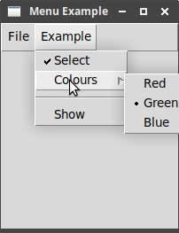
9.1. Menubars
Documentation on:
The following example illustrates most of the points in the
"Menubars" section ("menu-example.rs"):
root.title("Menu Example");
let menubar = rstk::make_menu(&root);

// -- create file menu
let file_menu = rstk::make_menu(&menubar);
file_menu.command()
    .label("New")
    .command(|| println!("You clicked 'New'"))
    .add();
file_menu.command()
    .label("Save")
    .state(rstk::State::Disabled)
    .add();
file_menu.separator().add();
file_menu.command()
    .label("Quit")
    .underline(0)
    .accelerator("Ctrl-Q")
    .command(|| rstk::end_wish())
    .add();

// -- create example menu
let example_menu = rstk::make_menu(&menubar);
example_menu.check_button()
    .label("Select")
    .command(|value| println!("Selection is now {}", value))
    .add();
let colours_menu = rstk::make_menu(&example_menu);
colours_menu.radio_button("colours", "red")
    .label("Red")
    .add();
colours_menu.radio_button("colours", "blue")
    .label("Blue")
    .add();
colours_menu.radio_button("colours", "green")
    .label("Green")
    .add();
example_menu.cascade()
    .menu(&colours_menu)
    .label("Colours")
    .add();
colours_menu.radio_button_value("colours", "blue");

example_menu.separator().add();

example_menu.command()
    .label("Show")
    .command(move || println!("Colour is: {}",
                              colours_menu.radio_button_value_get("colours")) )
    .add();

// -- combine menus into menubar
root.menu(&menubar);
menubar.cascade().menu(&file_menu).label("File").add();
menubar.cascade().menu(&example_menu).label("Example").add(); |
Menubar is automatically attached to the root. |
|
Menus are attached to the menubar. |
|
Command items have a label ("text") and an action ("command"). |
|
Menu items can be disabled. |
|
Adds a separator - horizontal line. |
|
Underlined character can be used in menu navigation. |
|
An accelerator is displayed, but you have to separately bind it. |
|
Creates a check button: use its command to handle the current value. |
|
Creates a submenu in an existing menu. |
|
Menu-level commands are used to set and retrieve the value of a menu radio-button group. |
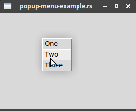
9.2. Contextual Menus
Otherwise known as "popup" menus, appearing, e.g., when you right-click on a window.
Example ("popup-menu-example.lisp"):
root.title("popup-menu-example.rs");

let menu = rstk::make_menu(&root);
for item in ["One", "Two", "Three"].iter() {
    menu.command()
        .label(item)
        .command(move || println!("You clicked {}", item))
        .add();
}

root.bind("<3>", move |event| {
    menu.popup(event.root_x, event.root_y);
}); |
Creates a menu. |
|
Binds the popup event to the root widget - you can use any widget. |
|
Displays the popup menu at screen coordinates taken from the given event. |
10. Windows and Dialogs
Read windows and dialogs.
10.1. Top-level windows
Documentation on:
-
constructor - make_toplevel
-
struct - TkTopLevel
Example of using some of the window functions ("window-example.rs"):
root.title("window-example.rs");
let open_1 = rstk::make_button(&root);
open_1.text("Open 1");
let open_2 = rstk::make_button(&root);
open_2.text("Open 2");

println!("Geometry of root at start: {}", root.geometry());

open_1.grid().row(0).column(0).layout();
open_2.grid().row(0).column(1).layout();

println!("Geometry of root when filled: {}", root.geometry());

{
    let root = root.clone();

    open_1.command(move || {
        let new_window = rstk::make_toplevel(&root);
        new_window.title("Window 1");
        new_window.iconify();
    });
}

{
    let root = root.clone();

    open_2.command(move || {
        let new_window = rstk::make_toplevel(&root);
        new_window.title("Window 2 - unresizable");
        new_window.resizable(false, false);
    });
}

root.on_close(|| {
    let result = rstk::message_box()
        .title("Really close?")
        .message("Still a chance to say no")
        .type_buttons(rstk::DialogType::YesNo)
        .show();

    if result == "yes" {
        rstk::end_wish();
    }
}); |
Use the function to create a new window - it is linked to the root window *tk*. |
|
Set the title using the separate wm-title function. |
|
Iconify the window. |
|
Change window so it cannot be resized. |
|
Asks user to confirm that they really want to close the program. |
10.2. Dialog windows
Apart from the Colour chooser, all of the dialogs use a builder style, like a
GridLayout. The main function is used to construct an initial set of values
for the dialog’s options. The listed functions then modify these values as
required. Finally, show is called to build and show the dialog.
The dialogs return option values: None if the dialog is cancelled,
or Some(value) for the chosen value.
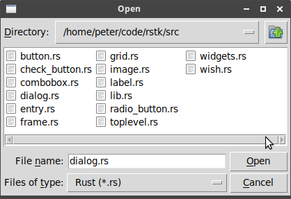
10.2.1. Selecting files and directories
Documentation on:
-
constructors
-
structs
Example of opening a file ("file-dialog-example.rs"):
let file = rstk::open_file_chooser()
    .title("Open")
    .file_types(&[("C++", ".cpp"), ("Rust", ".rs"), ("Any", "*")])
    .show();

println!("Filename: {}", file.unwrap_or(String::from("cancelled"))); |
Starts to build the open-file chooser … |
|
… sets its title |
|
… sets the file types using array of pairs |
|
… creates and shows the dialog. |
|
Result is an option - returns the full path of the chosen file, or none. |
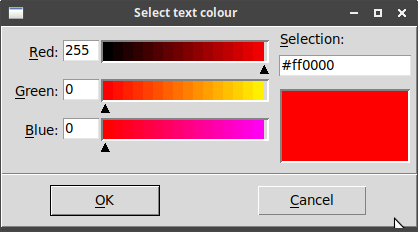
10.2.2. Selecting colours
Documentation on:
-
constructor - colour_chooser
-
struct - TkColourChooser
Example ("colour-chooser-example.rs"):
let colour = rstk::colour_chooser()
    .title("Select text colour")
    .initial_colour("red")
    .show();

let colour = colour.unwrap_or(String::from("blue"));

let label = rstk::make_label(&root);
label.text(&format!("In colour {}", colour));
label.foreground(&colour);

label.grid().layout(); |
Creates the colour chooser, sets two options, and then shows it. |
|
Unwraps the chosen colour, using a default if cancel was pressed. |
10.2.3. Selecting fonts
Documentation on:
-
functions - font_chooser_ACTION
The font-chooser dialog works differently to the previous dialogs.
A single dialog is available, which can be made visible at any
time. Some settings are available to change. The current font can
be retrieved at any time, or by using a command which is called
when a font is selected.
The chooser dialog also triggers the following virtual events:
-
<<TkFontchooserVisibility>> - when visibility of dialog changes
-
<<TkFontchooserFontChanged>> - when font choice changes
Example ("font-chooser-example.rs"):
root.title("Font Chooser Demo");
let button = rstk::make_button(&root);
button.text("Show font chooser");
button.command(|| { // toggles font chooser visibility
    if rstk::font_chooser_visible() {
        rstk::font_chooser_hide();
    } else {
        rstk::font_chooser_show();
    }
});
button.grid().column(0).row(0).layout();

let label = rstk::make_label(&root);
label.text("Text Widget 1");
label.font("Courier 14");
label.grid().column(0).row(1).layout();

rstk::font_chooser_parent(&root);
rstk::font_chooser_command(move |font| {
    label.font(&font.description);
}); |
Ensures the font-chooser is visible. |
|
When a font is selected, this function is called with an instance of a TkFont. |
|
The label’s font is then updated, using the font’s description. |
10.2.4. MessageBox: Alert and confirmation dialogs
Documentation on:
-
constructor - message_box
-
struct - TkMessageBox
The MessageBox is a flexible way to displaying alert, confirmation or informative dialogs to the user. The user can optionally add text as:
-
title- to the dialog window itself -
message- the main text in the window -
detail- a secondary piece of text
The icon can be chosen as one of Error, Information, Question or Warning types, and the list of buttons is one of AbortCancelIgnore, Ok, OkCancel, RetryCancel, YesNo, or YesNoCancel.
The MessageBox is created in a builder style, like GridLayout:
rstk::message_box()
  .OPTION(VALUE) // 0 or more
  .show();
The message_box call sets up a message box with default values. Calling the
option functions changes these default values. The dialog is finally created
and displayed when show is called.
Example ("messagebox-example.rs"):
rstk::message_box()
    .title("Example message box")
    .message("Click 'OK' to move \nto the next example")
    .show();

let result = rstk::message_box()
    .parent(&root)
    .title("Example 2")
    .message("Check docs")
    .detail("Did you know more docs are on the web?")
    .icon(rstk::IconImage::Information)
    .type_buttons(rstk::DialogType::YesNo)
    .show();

println!("You clicked {} on last dialog", result); |
Messages with newlines are displayed in multiple lines. |
|
The result of show is a string, the name of the button clicked. |
|
The icon type is selected from the given enumeration - defaults to "error". |
|
The dialog type specifies the buttons to show - defaults to "ok". |
11. Organising Complex Interfaces
11.1. Separator, Label Frame and Paned Window
The first three widgets discussed organise widgets appearing within a single view.
The separator is used to divide up groups:
-
constructors - make_separator
-
struct - TkSeparator
The label_frame to place widgets into named groups:
-
constructor - make_label_frame
-
struct - TkLabelFrame
The paned_window is a way to allow groups to be resized after display:
-
constructors - make_horizontal_paned_window and make_vertical_paned_window
-
struct - TkPanedWindow
These three are all illustrated in the following example
("separator-example.rs"):
root.title("Separator/Paned Window/Label Frame");

let panes = rstk::make_vertical_paned_window(&root);
panes.grid().column(0).row(0).sticky(rstk::Sticky::NESW).layout();
root.grid_configure_column(0, "weight", "1");
root.grid_configure_row(0, "weight", "1");

let frame_h = rstk::make_label_frame(&panes);
frame_h.text("Horizontal Separator");
let label_1 = rstk::make_label(&frame_h);
label_1.text("Label 1");
let label_2 = rstk::make_label(&frame_h);
label_2.text("Label 2");

label_1.grid().row(0).column(0).layout();
rstk::make_separator(&frame_h, rstk::Orientation:Horizontal)
    .grid().row(1).column(0).sticky(rstk::Sticky::EW).layout();
label_2.grid().row(2).column(0).layout();

frame_h.grid().row(0).column(0).padx(5).pady(5).layout();
panes.add(&frame_h);

let frame_v = rstk::make_label_frame(&panes);
frame_v.text("Vertical separator");
let label_3 = rstk::make_label(&frame_v);
label_3.text("Label 1");
let label_4 = rstk::make_label(&frame_v);
label_4.text("Label 2");

label_3.grid().row(0).column(0).layout();
rstk::make_separator(&frame_v, rstk::Orientation::Vertical)
    .grid().row(0).column(1).sticky(rstk::Sticky::NS).layout();
label_4.grid().row(0).column(2).layout();

frame_v.grid().row(0).column(0).padx(5).pady(5).layout();
panes.add(&frame_v); |
Creates the paned-window, which fills the root. |
|
Creates a labelled frame inside the paned-window, with text being the
label. |
|
Create a separator - use sticky(rstk::Sticky::EW) option so the line
fills the horizontal space. |
|
Add the labelled frame as a pane to the paned-window. |
|
Here we use a vertical separator to separate the two labels, and
sticky(rstk::Sticky::NS) for the layout. |
The result illustrates both the labelled frames and separators. The double-headed arrow appears when the mouse cursor is run over the separator in the paned-window: clicking and dragging resizes the two halves.
11.2. Notebook
Documentation on:
-
constructor - make_notebook
-
struct - TkNotebook
The last organisational widget discussed arranges widgets into separate pages, each of which can be brought to the front by clicking on a tab.
Example ("notebook-example.rs"):
root.title("Notebook Example");
let notebook = rstk::make_notebook(&root);
notebook.grid().column(0).row(0).sticky(rstk::Sticky::NESW).layout();
root.grid_configure_column(0, "weight", "1");
root.grid_configure_row(0, "weight", "1");
// add three panes to the notebook
for pane in ["Red", "Green", "Blue"].iter() {
let frame = rstk::make_frame(¬ebook);
let button = rstk::make_button(&frame);
let message = format!("Pane {}", pane);
button.text(&message);
button.command(move || println!("Clicked on button in {}", message));
button.grid().column(0).row(0).padx(10).pady(10).layout();
notebook.add(&frame, &pane);
} |
Creates an instance of the notebook. |
|
One frame is made per page to hold its contents. |
|
The add method adds the frame to the notebook. |
12. Fonts, Colours, Images
Read fonts, colours, images.
12.1. Fonts
Documentation on fonts.
Fonts are defined as a TkFont struct, with fields:
-
family: String
-
size: u32
-
weight: Weight (normal or bold)
-
slant: Slant (roman or italic)
-
underline: bool
-
overstrike: bool
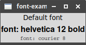
Example of using different fonts on labels ("font-example-1.lisp"):
root.title("font-example-1.rs");

let label_1 = rstk::make_label(&root);
label_1.text("Default font");
label_1.grid().row(0).layout();

let label_2 = rstk::make_label(&root);
label_2.text("font: helvetica 12 bold");
label_2.font(&rstk::TkFont {
    family: String::from("Helvetica"),
    size: 12,
    weight: rstk::Weight::Bold,
    ..Default::default()
});
label_2.grid().row(1).layout();

let label_3 = rstk::make_label(&root);
label_3.text("font: courier 8");
label_3.font(&rstk::TkFont {
    family: String::from("Courier"),
    size: 8,
    ..Default::default()
});
label_3.grid().row(2).layout(); |
Font values are used to set the display font of some widgets. |
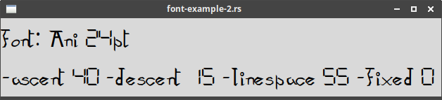
The standard fonts are available as functions, tk_default_font etc.
These functions return fresh instances of TkFont, and so can be copied/modified as required.
Example of creating a font using a font family found using
font_families ("font-example-2.lisp"):
root.title("font-example-2.rs");

let mut fonts = rstk::font_families();
fonts.sort();
println!("There are {} font families, e.g. \n{}\n{}\n{}",
         fonts.len(), fonts[0], fonts[1], fonts[200]);
let font = rstk::TkFont {
    family: fonts[1].clone(),
    size: 24,
    ..Default::default()
};

let label = rstk::make_label(&root);
label.text(&format!("font: {} 24pt\n{}", fonts[1], font.metrics()));
label.font(&font);
label.grid().layout(); |
Retrieve the available font families. |
|
Create a new font based on one of the retrieved font families. |
|
Display some metrics about the font whilst using the font in a label. |
Printed output:
$ cargo run --example font-example-2
There are 391 font families, e.g.
Abyssinica SIL
Ani
Noto Sans Kayah Li
Displayed font:
12.2. Colours
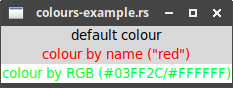
Wherever a colour is required, specify this colour as a string, by either:
| name |
using one of the values in the tk colours list |
| rgb |
as a 6-digit hexadecimal value in form "#RRGGBB" |
Example of coloured text:
root.title("colours-example.rs");

let label_1 = rstk::make_label(&root);
label_1.text("default colour");
label_1.grid().row(0).layout();

let label_2 = rstk::make_label(&root);
label_2.text("colour by name (\"red\")");
label_2.foreground("red");
label_2.grid().row(1).layout();

let label_3 = rstk::make_label(&root);
label_3.text("colour by RGB (#03FF2C/#FFFFFF)");
label_3.foreground("#03FF2C");
label_3.background("#FFFFFF");
label_3.grid().row(2).layout(); |
Sets foreground (text) colour using a name. |
|
Sets foreground (text) colour using RGB. |
|
Sets background colour using RGB. |
12.3. Images
read_image(filename: &str) → TkImage
Reads an image in given filename and returns a new image reference.
An example of using this is in the Label section.
13. Canvas
Read canvas.
Documentation on:
-
constructor - make_canvas
-
struct - TkCanvas
Create and configure a canvas:
let canvas = rstk::make_canvas(&root);
canvas.width(500);
canvas.height(400);
canvas.background("gray75");
13.1. Creating Items
Items (arcs, lines, text) are created using a create_TYPE method on
the canvas. Each item type is represented by its own struct: for example,
a line is represented by a TkCanvasLine struct. In this way, appropriate
methods can be called for each type of item on the canvas.
canvas.create_line(&[(10, 5), (200, 50)]);13.1.1. Item attributes
"fill", "dash", "outline" and "width" are supported for most of the items.
These can be set using configure or using named methods, after construction:
let line = canvas.create_line(&[(10, 5), (200, 50)]);
line.colour("red");
line.configure("width", "5"); // a 'width' method also exists13.1.3. Modifying Items
delete removes an item from the canvas.
13.2. Event Bindings
Events can be connected to either the canvas or canvas-item using bind, as
covered in Binding to events.
13.3. Tags
Tagging is also supported for each item - see TkCanvasTags trait.
13.4. Scrolling
Scrollbars can be added and used with a canvas, as with other widgets.
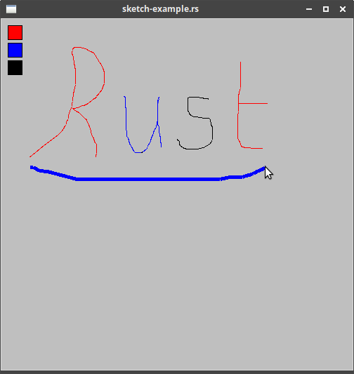
13.5. A Simple Sketchpad
Example of many of above ("sketch-example.rs"):
use rstk::*;
use std::sync::Arc;
use std::sync::Mutex;

fn main() {
    let root = rstk::start_wish().unwrap();

    let colour = Arc::new(Mutex::new("blue"));
    let last_x = Arc::new(Mutex::new(0));
    let last_y = Arc::new(Mutex::new(0));

    root.title("sketch-example.rs");
    let canvas = rstk::make_canvas(&root);
    canvas.width(500);
    canvas.height(400);
    canvas.background("gray75");

    canvas.grid().column(0).row(0).sticky(rstk::Sticky::NESW).layout();
    root.grid_configure_column(0, "weight", "1");
    root.grid_configure_row(0, "weight", "1");

    // add three rectangles, and option to change colour
    let rect_1 = canvas.create_rectangle((10, 10), (30, 30));
    rect_1.fill("red");
    {
        let colour = colour.clone();
        rect_1.bind("<1>", move |_| {
            let mut colour = colour.lock().unwrap();
            *colour = "red";
        });
    }

    let rect_2 = canvas.create_rectangle((10, 35), (30, 55));
    rect_2.fill("blue");
    {
        let colour = colour.clone();
        rect_2.bind("<1>", move |_| {
            let mut colour = colour.lock().unwrap();
            *colour = "blue";
        });
    }

    let rect_3 = canvas.create_rectangle((10, 60), (30, 80));
    rect_3.fill("black");
    {
        let colour = colour.clone();
        rect_3.bind("<1>", move |_| {
            let mut colour = colour.lock().unwrap();
            *colour = "black";
        });
    }

    {
        let canvasc = canvas.clone();
        canvas.bind("<B1-ButtonRelease>", move |_| {
            canvasc.configure_tag("currentline", "width", "1");
        });
    }

    {
        let last_x = last_x.clone();
        let last_y = last_y.clone();
        canvas.bind("<1>", move |event| {
            let mut last_x = last_x.lock().unwrap();
            *last_x = event.x as u64;
            let mut last_y = last_y.lock().unwrap();
            *last_y = event.y as u64;
        });
    }

    {
        let colour = colour.clone();
        let last_x = last_x.clone();
        let last_y = last_y.clone();
        canvas.clone().bind("<B1-Motion>", move |event| {
            let colour = colour.lock().unwrap();
            let mut last_x = last_x.lock().unwrap();
            let mut last_y = last_y.lock().unwrap();

            let line = canvas.create_line(&[(*last_x, *last_y),
                            (event.x as u64, event.y as u64)]);
            line.colour(*colour);
            line.width(5);
            line.add_tag("currentline");

            *last_x = event.x as u64;
            *last_y = event.y as u64;
        });
    }

    rstk::mainloop();
} |
Rust’s borrow-checker means we need some way to handle shared state. This is one option - wrapping values in a Mutex and Arc. Why a mutex? Because using values inside a closure requires them to be safe for multi-threading. |
|
Creates the canvas. |
|
Bind an event to the rectangle. |
|
The colour must be cloned and then unwrapped before we can change its value. |
|
On mouse release, uses a tag to change width of last line. |
|
Binds the left-button-down event, to start a coordinate. |
|
Binds the mouse-movement event, to draw a line from last point to current point. |
|
Adds a line onto the canvas - the last argument is a list of pairwise-points. |
|
Adds a tag to the line, to reference later. |
14. Text Widget
The text widget was covered before in Text: tkdocs covers more of the advanced features of the widget in this section.
Read text.
Documentation on:
Text widgets are created using the make_text constructor:
let text = rstk::make_text(&root);
text.height(10);
text.width(40);
14.1. The Basics
14.1.1. Providing Initial Content
rstk provides both insert and insert_end.
Insert accepts a "(line, character)" definition as a tuple along with the text to insert.
Insert_end adds text to the end of the current widget, and is the same as calling Tk’s "insert end" command.
text.insert((1,0), "here is my\ntext to insert")14.1.2. Retrieving the Text
rstk provide get and get_to_end.
Get is used to retrieve text between two (line, character) indices:
text.get((2,10), (4,12));Where the second index is the end of the widget, use get_to_end:
text.get_to_end((1, 0));14.1.3. Customising Appearance
rstk supports the described functions for customising appearance:
-
foreground
-
background
-
padx, pady
-
border_width
-
relief
14.1.4. Wrapping and Scrolling
Wrapping can be set to Word, Char or None:
text.wrap(rstk::Wrapping::Word);Scrollbars can be added:
Example of a scrollable text widget ("text-example-2.rs"):
use rstk::*;

const TEXT: &str = "Rust has great documentation, a friendly compiler with useful error messages, and top-notch tooling - an integrated package manager and build tool, smart multi-editor support with auto-completion and type inspections, an auto-formatter, and more. -- https://rust-lang.org";

fn main() {
    let root = rstk::start_wish().unwrap();
    root.title("text-example-2.rs");

    let text = rstk::make_text(&root);
    text.width(40);
    text.height(5);
    text.wrap(rstk::Wrapping::None);
    for _ in 0..10 {
        text.insert_end(&TEXT);
        text.insert_end("\n");
    }

    let hscroll = rstk::make_horizontal_scrollbar(&root, &text);
    let vscroll = rstk::make_vertical_scrollbar(&root, &text);

    text.grid().column(0).row(0).sticky(rstk::Sticky::NESW).layout();
    hscroll.grid().column(0).row(1).sticky(rstk::Sticky::EW).layout();
    vscroll.grid().column(1).row(0).sticky(rstk::Sticky::NS).layout();
    root.grid_configure_column(0, "weight", "1");
    root.grid_configure_row(0, "weight", "1");

    text.see((6, 30)); // starts with line 6, character 30 on display

    rstk::mainloop();
} |
Turns off wrapping - this widget will have long lines of text. |
|
Appends text to the end of the widget - notice the addition of a newline. |
|
Scrollbars are automatically associated with the text widget … |
|
… and just need placing appropriately in the display. |
|
The weight settings ensure the grid expands to fill the top-level frame. |
|
Use see to show a particular point of text. |
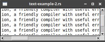
14.1.5. Disabling the Widget
To disable a text widget, set its state to rstk::State::Disabled:
text.state(rstk::State::Disabled);and re-enable it using rstk:::State::Normal.
14.2. Modifying the Text in Code
14.2.1. Text Positions and Indices
Only one representation of text position is supported in the rstk functions, and that is as a tuple:
-
(line, character) - position, where line 1, character 0 is first character on first line
"end" is not explicitly represented, but separate functions are used to implicitly
use "end" - e.g. insert_end is equivalent to "insert end".
14.2.2. Deleting Text
rstk provides delete and delete_char.
For example, starting text with "abcd\nefgh":
text.delete_char((1,2));   // => "abd\nefgh"
text.delete((1,1), (1,2)); // => "acd\nefgh"
text.delete((1,0), (2,0)); // => "efgh"
text.delete((1,2), (2,1)); // => "abfgh"
rstk also provides replace:
text.replace((1,2), (2,1), "--"); // => "ab--fgh"These methods can be tested in "text-example-3.rs".
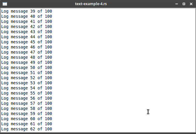
14.2.3. Example: Logging Window
Example ("text-example-4.rs"):
use rstk::*;

/// Adds 'msg' to given 'log_text', but ensures only 24-lines are shown.
fn write_to_log(msg: &str, log_text: &rstk::TkText) {
    let num_lines = log_text.get_to_end((1,0)).lines().count();

    log_text.state(rstk::State::Normal);
    if num_lines == 24 { // delete first line, if there are 24 already
        log_text.delete((1,0), (2,0));
    }
    log_text.insert_end(msg);
    log_text.insert_end("\n");
    log_text.state(rstk::State::Disabled);
}

fn write_messages(count: u32, log_text: rstk::TkText) {
    if count <= 100 {
        rstk::after(100, move || {
            write_to_log(&format!("Log message {} of 100", count), &log_text);
            write_messages(count + 1, log_text.clone());
        });
    }
}

fn main() {
    let root = rstk::start_wish().unwrap();
    root.title("text-example-4.rs");

    let log_text = rstk::make_text(&root);
    log_text.height(24);
    log_text.width(80);
    log_text.wrap(rstk::Wrapping::None);
    log_text.state(rstk::State::Disabled);

    log_text.grid().sticky(rstk::Sticky::NESW).layout();
    root.grid_configure_column(0, "weight", "1");
    root.grid_configure_row(0, "weight", "1");

    write_messages(1, log_text.clone());

    rstk::mainloop();
} |
To insert text, we need it to be in normal state first. |
|
Deletes the first line of text. |
|
Return the text widget to a readonly state. |
|
Function used to set up the delayed display of a message. |
|
Uses "after" to delay the print of a message … |
|
… recursively calls itself to repeat. Notice the cloning of "log_text" to keep an owned reference to the text widget. |
14.3. Formatting with Tags
14.3.1. Adding Tags to Text
rstk provides the tag_add method on text:
text.tag_add("highlightline", (5,0), (6,0));and versions of the insert methods to include tags:
text.insert_end_with_tags("new material to insert",
                          &["highlightline", "recent", "warning"]);
14.3.2. Applying Formatting to Tags
rstk provides tag_configure to set one option at a time. The value
must always be a string:
text.tag_configure("highlightline", "background", "yellow");
text.tag_configure("highlightline", "font", rstk::tk_fixed_font().to_string());
text.tag_configure("highlightline", "relief", rstk::Relief::Raised.to_string());
14.3.3. More Tag Manipulations
tag_delete deletes a single tag.
tag_remove is the opposite of tag_add, removing a tag from a given
range of text.
tag_names returns a vector of all tags defined in the text.
tag_names_at( (line, character) ) returns a vector of all tags defined at given
point in the text.
|
Querying ranges for tags is not currently supported. |
14.4. Events and Bindings
tag_bind is used to bind closures to tags.
text.tag_bind("important", "1", |event| { println!("action"); });14.5. Selecting Text
Uses the tag "sel".
14.6. Marks
The described methods are all provided in rstk: mark_set, mark_unset,
mark_previous, mark_next, mark_names and mark_gravity_left, mark_gravity_right.
In Tk, marks can be used as indices in all methods requiring a position. In rstk,
there is a method mark_index which returns the (line, character) tuple position
for a given mark, which can then be used in other methods.
14.7. Images and Widgets
Add images to the text widget using insert_image:
let flowers = rstk::read_image("flowers.png");
text.insert_image((line, character), &flowers);
Add widgets to the text widget using insert_widget:
let button = rstk::make_button(&text);
text.insert_widget((line, character), &button);
14.8. Even More
For some of the more advanced functions, there may not be equivalent bindings
in rstk. However, these should all be accessible by using the lower-level
methods such as configure, cget, or directly writing the Tk string and
calling tell_wish.
rstk does support search:
text.search("string", (1,0)); // search for 'string' from start position15. Treeview
Documentation on:
-
constructor - make_treeview
-
struct - TkTreeview
Treeview widgets are created using the make_treeview function:
let treeview = rstk::make_treeview(&root);Scrollbars can be added, in the usual way.
15.1. Adding Items to the Tree
Items can be added at the top-level, directly to the treeview, or under existing items. Items can also be added at the end of the current set of items, or at a given index value.
let item1 = treeview.insert_item();       // creates new top-level item at end
let item2 = treeview.insert_item_at(0);   // same, but inserts as first child
let item3 = item1.insert_item();          // creates new item as child of item1
let item4 = item1.insert_item_at(0);      // same, but inserts as first child of item1
15.2. Rearranging Items
Items can be moved to a given index of a new parent.
treeview.move_item(&item3, &item2, 0); // moves item3 to become first child in item2Items can be deleted:
item3.delete();The methods "previous", "next", "children" and "parent" are all supported.
The item’s open state can be queried or changed using "is_open" or "open".
15.3. Displaying Information for each Item
Columns are referenced by a symbolic name, which is set using the columns
method:
tree.columns(&["size", "modified", "owner"]);The heading for each column can have its text, image and alignment set:
tree.heading_text("size", "Size");Each column can have its width, alignment etc set:
tree.column_width("size", 100);
tree.column_anchor("size", rstk::Anchor::Centre);
Each item has a set of values, one per column:
let item3 = tree.insert_item();
item3.values(&["15KB", "Yesterday", "mark"]);
The text/image for the item (to show on the 'left', under the tree column):
item3.text("Listbox");
item3.anchor(rstk::Anchor::Centre);
15.4. Item Appearance and Events
"tags" are supported with tag_add, tag_has and tag_remove methods defined on
treeview items, and tag_names and tag_configure defined on the treeview itself.
tag_bind is provided to bind to events.
let item = tree.insert_item();
item.text("button");
item.add_tag("ttk");
item.add_tag("simple");
tree.tag_configure("ttk", "background", "yellow");
tree.tag_bind("ttk", "<1>", |event| { println!("itemclicked"); });
// use tree.focus() to get the clicked item
15.5. Customising the Display
height, column_width and column_min_width, among others, are provided to customise
the display.
A treeview combines a tree with a table-like set of headings. The "show" methods alter
which parts of this are visible: show_tree, show_headings, or show_all.
select_mode allows the form of selections to be changed: rstk’s single/multiple/none are
associated with Tk’s browse/extended/none.
15.6. Example
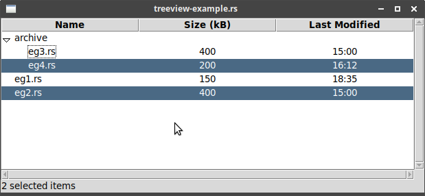
Example ("treeview-example.rs"):
root.title("treeview-example.rs");

let treeview = rstk::make_treeview(&root);
treeview.columns(&["size", "modified"]);
treeview.heading_text("#0", "Name");
treeview.heading_text("size", "Size (kB)");
treeview.heading_text("modified", "Last Modified");

let hscroll = rstk::make_horizontal_scrollbar(&root, &treeview);
let vscroll = rstk::make_vertical_scrollbar(&root, &treeview);

treeview.grid().column(0).row(0).sticky(rstk::Sticky::NESW).layout();
hscroll.grid().column(0).row(1).sticky(rstk::Sticky::EW).layout();
vscroll.grid().column(1).row(0).sticky(rstk::Sticky::NS).layout();
root.grid_configure_column(0, "weight", "1");
root.grid_configure_row(0, "weight", "1");

// -- alter alignments
treeview.column_anchor("size", rstk::Anchor::Centre);
treeview.column_anchor("modified", rstk::Anchor::Centre);

// -- add a feedback label
let label = rstk::make_label(&root);
label.grid().column(0).row(2).sticky(rstk::Sticky::EW).layout();

// -- populate treeview with dummy items
let item1 = treeview.insert_item();
item1.text("eg1.rs");
item1.values(&["150", "18:35"]);
let item2 = treeview.insert_item();
item2.text("eg2.rs");
item2.values(&["400", "15:00"]);
let item3 = treeview.insert_item_at(0);
item3.text("archive");
let item4 = item3.insert_item();
item4.text("eg3.rs");
item4.values(&["400", "15:00"]);
let item5 = item3.insert_item();
item5.text("eg4.rs");
item5.values(&["200", "16:12"]);

// -- bind a function to respond to selections
treeview.clone().bind("<<TreeviewSelect>>", move |_| {
    let selected_items = treeview.selected_items();
    label.text(&format!("{} selected items", selected_items.len()));
});
label.text(&format!("{} selected items", selected_items.len()));
}); |
Creates treeview instance. |
|
Adds two columns to treeview - these names are used as references. |
|
Sets the heading for the tree heading, with special "#0" designator. |
|
Sets the heading for the added columns. |
|
Centres the contents of the column. |
|
Adds a new item to root of treeview … |
|
… gives it a value for the 'tree' column |
|
… and values for the added columns. |
|
Item added as a child of another item. |
|
Binds an event to be called when the selection changes. |
|
Retrieves the selected items - the contents are new instances
containing information on the item. Use == tests to check if,
for example, the original item2 has been selected. |
16. Styles and Themes
Read styles and themes.
16.1. Using existing themes
There are two functions to work with the existing themes:
-
theme_names - lists available themes
-
use_theme - uses the given theme
Example:
let themes = rstk::theme_names();
println!("{} available themes: ", themes.len());
for theme in themes {
    println!(" - {}", theme);
}
On my Linux system:
4 available themes:
 - clam
 - alt
 - default
 - classic
The grid-example program, after setting each of the four choices in turn: