Provides LTk examples for the tkdocs tutorial.
Sections are named after the equivalent tkdocs section, include a link to the original section for reading, and then example lisp code and screenshots.
|
There are two major options for using tk from Lisp (that I am aware of). The original LTk, and a much-extended fork, nodgui. The two libraries are mostly compatible, and the information on this page is intended for both - any differences are noted. |
Examples are tested on Linux using sbcl version 2.1.3, ltk version 0.992 and nodgui version 0.1.1 (via quicklisp).
Download "ltk-examples.zip" or "nodgui-examples.zip" from the latest version.
Only a subset of what is available in Tk is illustrated here - more information is available for LTk / nodgui and in the Tk documentation.
Contents:
1. Introduction |
9. Menus |
4. Tk Concepts |
|
13. Canvas |
|
14. Text Widget |
|
7. More Widgets |
15. Treeview |
8. Event Loop |
This document and its examples builds on the tkdocs
tutorial by Mark Roseman, and has the same license:

Introduction
Read introduction.
Installing Tk
Read installing Tk.
The Obligatory First Program
If using LTk
 Type the following into a text file called "hello.lisp" (or
download from link above):
Type the following into a text file called "hello.lisp" (or
download from link above):
(require 'asdf)
(require 'ltk)                                              ;
(use-package :ltk)                                          ;

(with-ltk ()                                                ;
          (grid                                             ;
            (make-instance 'button :text "Hello World")     ;
            0 0))                                           ;
|
States that we are using the ltk package. |
|
Uses the ltk package, so we do not have to prefix all the ltk symbols with "ltk:". (This is a matter of preference, but for clarity in the examples, we will always use ltk.) |
|
Starts the ltk connection with the tk program - your gui code must be called from within this context. |
|
Arranges the given widget in its parent using a grid layout. |
|
Creates an instance of a button - notice we use CLOS, and the button has a text label. |
|
Remaining parameters for the grid layout - the button goes in position (0, 0) - row 0, column 0. |
If using nodgui
Type the following into a text file called "hello.lisp" (or
download from link above):
(require 'asdf)
(require 'nodgui)                                              ;
(use-package :nodgui)                                          ;

(with-nodgui ()                                                ;
             (grid                                             ;
               (make-instance 'button :text "Hello World")     ;
0 0)) ; |
States that we are using the nodgui package. |
|
Uses the nodgui package, so we do not have to prefix all the nodgui symbols with "nodgui:". (This is a matter of preference, but for clarity in the examples, we will always use nodgui.) |
|
Starts the nodgui connection with the tk program - your gui code must be called from within this context. |
|
Arranges the given widget in its parent using a grid layout. |
|
Creates an instance of a button - notice we use CLOS, and the button has a text label. |
|
Remaining parameters for the grid layout - the button goes in position (0, 0) - row 0, column 0. |
Running the program
Run the program from the command line using:
$ sbcl --script hello.lisp
And see the window open:

|
|
If you are not using sbcl, you may need to change the first few lines to
properly include the libraries. For example, when using clisp, the require
statements must take a string, not a symbol.
|
A First (Real) Example
Read a first example.
|
To save some repetition, all the following examples will assume you have included and started your preferred library. |
If you are using LTk:
(require 'asdf)
(require 'ltk)
(use-package :ltk)

(with-ltk ()
   ; PASTE THE EXAMPLE HERE
) |
Replace this comment with the example code. |
or, if you are using nodgui:
(require 'asdf)
(require 'nodgui)
(use-package :nodgui)

(with-nodgui ()
   ; PASTE THE EXAMPLE HERE
) |
Replace this comment with the example code. |
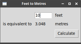
Example ("first-example.lisp"):
(wm-title *tk* "Feet to Metres") ;
(let ((content (make-instance 'frame))) ;
(configure content :padding "3 3 12 12") ;
(grid content 0 0 :sticky "nsew")
(grid-columnconfigure *tk* 0 :weight 1)
(grid-rowconfigure *tk* 0 :weight 1)
(let* ((feet-entry (make-instance 'entry :master content :width 7)) ;
(metres-label (make-instance 'label :master content :text "")))
(flet ((calculate () ;
(let ((feet (read-from-string (text feet-entry))))
(setf (text metres-label)
(if (numberp feet)
(/ (round (* 0.3048 feet 10000.0)) 10000.0)
"")))))
; top row has the entry widget and explanatory label to its right
(grid feet-entry 1 2 :sticky "we" :padx 5 :pady 5) ;
(grid (make-instance 'label :master content :text "feet")
1 3 :sticky "w" :padx 5 :pady 5)
; middle row has three labels
(grid (make-instance 'label :master content :text "is equivalent to")
2 1 :sticky "e" :padx 5 :pady 5)
(grid metres-label 2 2 :sticky "we" :padx 5 :pady 5)
(grid (make-instance 'label :master content :text "metres")
2 3 :sticky "w" :padx 5 :pady 5)
; last row has the button on right
(grid (make-instance 'button :master content ;  :text "Calculate"
:command #'calculate)
3 3 :sticky "w" :padx 5 :pady 5)
(focus feet-entry) ;
:text "Calculate"
:command #'calculate)
3 3 :sticky "w" :padx 5 :pady 5)
(focus feet-entry) ;  (bind *tk* "<Return>" (lambda (evt) (calculate)))))) ;
|
*tk* is the root window - this command sets its title |
|
Creates the inner-frame, to hold our window content. Note that master is
assumed to be the root window, if not given. |
|
These lines place the frame in the window, and ensure it expands to fill the whole root window. The "padding" gives some space around the edges. |
|
Create the "entry" widget to enter the number of feet: master is specified, so as
to place it in the right container. The later call to grid will arrange it within
its container. |
|
Function to perform the calculation. It reads the value from feet-entry and writes
back to metres-label using the text accessor. |
|
Here we place the widget in the container, at an appropriate row/column. |
|
The button is created and placed in one command - notice the command keyword,
referencing the calculate function. |
|
Give the entry field focus. |
|
Binds the "Return" key to the calculate function, so pressing return will
re-calculate the value. |
Tk Concepts
Read Tk concepts.
Creating widgets in LTk
All of the Tk widgets are wrapped as Lisp classes. So, to make a button in the previous example, we called:
(make-instance 'button :master content :text "Calculate" :command #'calculate)Some of the widgets also have make-WIDGET function equivalents, such as
make-menubar - these are not generally documented, except in the LTk source.
Widget introspection
Tk provides the "winfo" command to access information about widgets. Several of these functions are provided directly in LTk:
screen-height (&optional widget)
Height of screen in pixels (screen of widget, if given).
screen-height-mm (&optional widget)
Height of screen in millimetres (screen of widget, if given).
screen-mouse (&optional widget)
Gives the position of the mouse on screen as (x,y) (screen of widget, if given). (In tk - "pointerxy".)
screen-mouse-x (&optional widget)
Gives the x position of the mouse on screen (screen of widget, if given). (In tk - "pointerx".)
screen-mouse-y (&optional widget)
Gives the y position of the mouse on screen (screen of widget, if given). (In tk - "pointery".)
screen-width (&optional widget)
Width of screen in pixels (screen of widget, if given).
screen-width-mm (&optional widget)
Width of screen millimetres (screen of widget, if given).
window-height (toplevel)
Returns the window height of the toplevel window in pixels.
window-id (toplevel)
Returns the window id of the toplevel window.
window-x (toplevel)
Returns the x position of the toplevel window in pixels.
window-width (toplevel)
Returns the window width of the toplevel window in pixels.
window-y (toplevel)
Returns the y position of the toplevel window in pixels.
Binding to events
bind (widget event function)
-
widget- the widget to bind the event to -
event- the event to bind -
function- a function which accepts a single parameter, the event.
The event passed to the function is a struct called event, with the
following slots (see manual for
more information on each):
-
x- x-coord, in the widget, of the event -
y- y-coord, in the widget, of the event -
keycode- for keycode events, gives the keycode used to trigger the event -
char- ("keysym" in tk), gives the key symbol used to trigger the event -
width- used in "configure" events, specifying width -
height- used in "configure" events, specifying height -
root-x- x-coord, relative to screen, of the event -
root-y- y-coord, relative to screen, of the event -
mouse-button- ("button" in tk), gives the mouse button number used to trigger the event
(let ((label (make-instance 'label :text "Starting...")))
  (grid label 0 0 :padx 10 :pady 10)
  (bind label "<Enter>"
        (lambda (evt) (setf (text label) "Moved mouse inside")))
  (bind label "<Leave>"
        (lambda (evt) (setf (text label) "Moved mouse outside")))
  (bind label "<ButtonPress-1>"
        (lambda (evt) (setf (text label) "Clicked left mouse button")))
  (bind label "<3>"
        (lambda (evt) (setf (text label) "Clicked right mouse button")))
  (bind label "<Double-1>"
        (lambda (evt) (setf (text label) "Double clicked")))
  (bind label "<B3-Motion>"
        (lambda (evt) (setf (text label)
                            (format nil "Right button drag to ~a ~a"
                                    (event-x evt) (event-y evt))))))
Basic Widgets
Read basic widgets.
|
|
The tkdocs examples often refer to tying a tk-widget to a variable: as the value of the tk-widget changes, so does the value in the variable. LTk does not appear to support this, and so widgets must be directly queried for their values. |
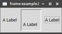
Frame
The most important options decorate the frame with a 3D border:
-
borderwidth- width of border -
relief- type of border: flat (default), raised, sunken, solid, ridge, or groove
(wm-title *tk* "frame-example.lisp")
(let ((frame1 (make-instance 'frame))                                 ;
      (frame2 (make-instance 'frame :borderwidth 2 :relief :sunken))  ;
      (frame3 (make-instance 'frame :borderwidth 2 :relief :groove)))
  (grid frame1 0 0 :padx 5 :pady 5)
  (grid frame2 0 1 :padx 5 :pady 5)
  (grid frame3 0 2 :padx 5 :pady 5)

  (configure frame1 :padding "2")                                     ;
  (configure frame2 :padding "5 40 10 10")

  (grid (make-instance 'label :master frame1 :text "A Label")
        0 0)
  (grid (make-instance 'label :master frame2 :text "A Label")
        0 0)
  (grid (make-instance 'label :master frame3 :text "A Label")
0 0)) |
Empty frame. |
|
Frame with border and relief settings. |
|
Apply some interior padding to the frames. |
When displayed, we can see the impact of the border/relief settings, and also how the interior padding affects the position of the label:
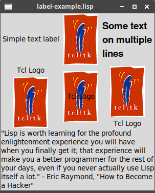
Label
This example uses a font and image: for more on those topics see Fonts, Colours, Images.
|
A change is needed in line 3 if you are using nodgui, see note 2 below. |
(wm-title *tk* "label-example.lisp")
(let* ((label-1 (make-instance 'label :text "Simple text label"))     ;
       (image (image-load (make-image) "tcllogo.gif"))                ;
       (label-2 (make-instance 'label :image image))                  ;
       (label-3 (make-instance 'label                                 ;
                               :font "Helvetica 14 bold"
                               :text (format nil "Some text~&on multiple~&lines")))
       (label-4 (make-instance 'label :image image :text "Tcl Logo")) ;
       (label-5 (make-instance 'label :image image :text "Tcl Logo"))
       (label-6 (make-instance 'label :image image :text "Tcl Logo"))
       (text "\"Lisp is worth learning for the profound enlightenment experience you will have when you finally get it; that experience will make you a better programmer for the rest of your days, even if you never actually use Lisp itself a lot.\" - Eric Raymond, \"How to Become a Hacker\"")
       (label-7 (make-instance 'label :text text :wraplength 300)))   ;

  (configure label-4 :compound :bottom)                               ;
  (configure label-5 :compound :center)
  (configure label-6 :compound :top)

  (grid label-1 0 0)
  (grid label-2 0 1)
  (grid label-3 0 2)
  (grid label-4 1 0)
  (grid label-5 1 1)
  (grid label-6 1 2)
(grid label-7 2 0 :columnspan 3 :sticky "news")) |
Label with text |
|
NOTE: For nodgui, use (image (make-image "tcllogo.gif")) |
|
Label with image |
|
Label with multi-line text - notice the use of format to get the newline
characters. Also, we add a :font descriptor, to change how the text is
displayed. |
|
Labels can be created with both an image and text, but see <7>. |
|
Longer text labels can be wrapped, using :wraplength to set the line
width, here in pixels. |
|
To display both image and text, use the :compound option. |
The :compound option controls which of the image and text are displayed, and how
they are arranged. The possible values are:
-
:text- text only -
:image- image only -
:center- text centred on the image -
:top,:bottom,:left,:right- position of image relative to text
The second row of the example illustrates three arrangements of the image and text.
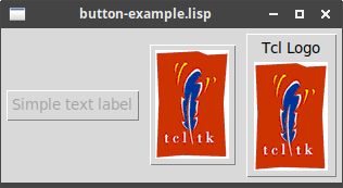
Button
Buttons, like labels, can be made from text and images, although multi-line text is not
supported. However, unlike labels, they provide a command, which is called when the
button is clicked.
|
|
A change is needed in line 4 if you are using nodgui, see note 2 below. |
(wm-title *tk* "button-example.lisp")
(let* ((button-1 (make-instance 'button :text "Simple text label"     ;
                               :command (lambda () (format t "button-1~&"))))
       (image (image-load (make-image) "tcllogo.gif"))                ;
       (button-2 (make-instance 'button :image image
                                :command (lambda () (format t "button-2~&"))))
       (button-3 (make-instance 'button :image image :text "Tcl Logo" ;
                                :command (lambda () (format t "button-3~&")))))

  (configure button-3 :compound :bottom)                              ;
  (configure button-1 :state :disabled)                               ;

  (bind *tk* "<Return>" (lambda (evt) (funcall (command button-2))))  ;

  (grid button-1 0 0)
  (grid button-2 0 1)
(grid button-3 0 2)) |
Simple button with text label |
|
NOTE: For nodgui, use (image (make-image "tcllogo.gif")) |
|
Button with text and image … |
|
… which must be configured to display both. |
|
The state may be :active or :disabled. |
|
The command of a button can be called directly, e.g. to set up a default action. |
Checkbutton
Just like buttons, but with an on/off state.
Note:
-
The
commandfunction now takes a value, the new state of the check-button: the value is Tcl’s 1 for on, 0 for off. -
The
valuefunction can retrieve or set the value of the check-button, using Lisp’s T/nil for on/off.
|
|
A change is needed in line 5 if you are using nodgui, see note 2 below. |
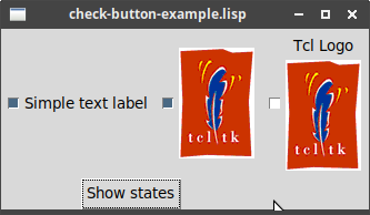
(wm-title *tk* "check-button-example.lisp")
(let* ((button-1 (make-instance 'check-button :text "Simple text label"   ;
                               :command (lambda (value) (format t "button-1 now ~a~&"
                                                                 value))))
       (image (image-load (make-image) "tcllogo.gif"))                    ;
       (button-2 (make-instance 'check-button :image image
                                :command (lambda (value) (format t "button-2 ~a~&"
                                                                 value))))
       (button-3 (make-instance 'check-button :image image :text "Tcl Logo"
                                :command (lambda (value) (format t "button-3 ~a~&"
                                                                 value))))
       (show (make-instance 'button :text "Show states"
                            :command (lambda ()
                                       (format t "Buttons ~a ~a ~a~&"
                                               (value button-1)           ;
                                               (value button-2)
                                               (value button-3))))))

  (setf (value button-1) t)                                               ;
  (configure button-3 :compound :bottom)

  (grid button-1 0 0 :padx 5 :pady 5)
  (grid button-2 0 1 :padx 5 :pady 5)
  (grid button-3 0 3 :padx 5 :pady 5)
(grid show 1 0 :columnspan 3)) |
The set up is the same as for a button, except the command now accepts the new
check-button value. |
|
NOTE: For nodgui, use (image (make-image "tcllogo.gif")) |
|
value retrieves the check-button’s state, as T/nil for on/off. |
|
setf value sets the check-button’s state, using T/nil for on/off. |
Radiobutton
(wm-title *tk* "radio-button-example.lisp")
(let* ((button-1 (make-instance 'radio-button :text "Red"       ;
                                :value :red
                                :variable "colours"))
       (button-2 (make-instance 'radio-button :text "Green"
                                :value :green
                                :variable "colours"))
       (button-3 (make-instance 'radio-button :text "Blue"
                                :value :blue
                                :variable "colours"))
       (show (make-instance 'button :text "Show state"
                            :command (lambda ()
                                       (format t "Colour: ~a~&" ;
                                               (value button-3))))))

  (setf (value button-3) :blue)                                 ;

  (grid button-1 0 0 :padx 5 :pady 5)
  (grid button-2 0 1 :padx 5 :pady 5)
  (grid button-3 0 3 :padx 5 :pady 5)
(grid show 1 0 :columnspan 3))) |
Radio buttons are created with a :value and a group :variable.
All radio buttons in the same group should have the same :variable
value, but each will have a distinct :value. |
|
The value of the selected radio-button is retrieved using value:
all buttons in the group return the same value. |
|
The value of the group can be set using setf value: setting the
value on one button in the group affects the whole group equally. |

|
|
After using setf value, the display does not show the updated
value.
|
Entry
(let* ((entry-1 (make-instance 'entry))                       ;
       (entry-2 (make-instance 'entry :show "*"))             ;
       (show (make-instance 'button
                            :text "Show entries"
                            :command (lambda ()
                                       (format t "~a ~a~&"
                                               (text entry-1) ;
                                               (text entry-2))))))

  (grid (make-instance 'label :text "Name:") 0 0)
  (grid entry-1 0 1 :pady 5)
  (grid (make-instance 'label :text "Password:") 1 0)
  (grid entry-2 1 1 :pady 5)

(grid show 2 0 :columnspan 2)) |
Creates a standard "entry" widget |
|
Creates an "entry" widget suitable for entering passwords |
|
text retrieves the text entered into the "entry" widget |
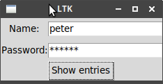
After typing a few things and clicking "Show entries":
$ sbcl --script entry-example.lisp
peter random
Notice that the password "random" is hidden behind asterisks.
|
|
LTk currently does not support "validatecommand". |
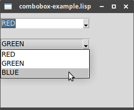
Combobox
(wm-title *tk* "combobox-example.lisp")
(let ((cb1 (make-instance 'combobox :values '(red green blue)))   ;
      (cb2 (make-instance 'combobox :values '(red green blue) :state 'readonly)))

  (grid cb1 0 0 :pady 10)
  (grid cb2 1 0 :pady 10)

  (bind cb2 "<<ComboboxSelected>>"                                ;
(lambda (evt) (format t "cb2 is now ~a~%" (text cb2))))) |
Creates instances of combo-boxes, with a preset list of values |
|
Binds the "ComboboxSelected" event, to respond whenever a new item is chosen from the list. |
The Grid Geometry Manager
LTk grid functions
The following functions are provided:
grid (widget row column &key columnspan ipadx ipady padx pady rowspan sticky)
-
widget- the button, label, frame etc to be placed -
row- the row number, index from 0 -
column- the column number, index from 0 -
columnspan n- the number of columns this widget should span -
ipadx n- internal padding by n pixels (left/right) -
ipady n- internal padding by n pixels (top/bottom) -
padx n- external padding by n pixels (left/right) -
pady n- external padding by n pixels (top/bottom) -
rowspan n- the number of rows this widget should span -
sticky dirs- makes widget grow in specifieddirs, some combination of n, s, e, w.
|
Note the order of row column - the tutorial usually specifies the column first.
|
grid-columnconfigure (widget column option value)
-
widget- the button, label, frame etc to be placed -
column- the column number, index from 0 -
option- option to change - see manual -
value- new value
grid-rowconfigure (widget row option value)
-
widget- the button, label, frame etc to be placed -
row- the row number, index from 0 -
option- option to change - see manual -
value- new value
grid-configure (widget option value)
-
widget- the button, label, frame etc to be placed -
option- option to change - see manual -
value- new value
grid-forget (widget)
-
widget- the button, label, frame etc to be removed
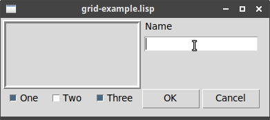
Example
(Corresponding to the combined example in the Padding subsection.)
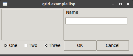
Example ("grid-example.lisp"):
(wm-title *tk* "grid-example.lisp")
; first, make some widgets and parent frames
(let* ((content (make-instance 'frame))
       (frame (make-instance 'frame :master content
                             :borderwidth 5 :relief :ridge
                             :width 200 :height 100))
       (name-label (make-instance 'label :master content
                                  :text "Name"))
       (name (make-instance 'entry :master content))
       (cb-1 (make-instance 'check-button :master content :text "One"))
       (cb-2 (make-instance 'check-button :master content :text "Two"))
       (cb-3 (make-instance 'check-button :master content :text "Three"))
       (ok (make-instance 'button :master content :text "OK"))
       (cancel (make-instance 'button :master content :text "Cancel")))
  ; -- some adjustments to the widgets/frames
  (configure content :padding "3 3 12 12")
  (setf (value cb-1) t
        (value cb-2) nil
        (value cb-3) t)
  ; -- layout the widgets in the grid
  (grid content 0 0 :sticky "nsew")                               ;
  (grid frame 0 0 :columnspan 3 :rowspan 2 :sticky "nsew")        ;
  (grid name-label 0 3 :columnspan 2 :sticky "nw" :padx 5)        ;
  (grid name 1 3 :columnspan 2 :sticky "new" :pady 5 :padx 5)
  (grid cb-1 3 0)
  (grid cb-2 3 1)
  (grid cb-3 3 2)
  (grid ok 3 3)
  (grid cancel 3 4)
  ; -- tidy up the layout and resizing properties
  (grid-columnconfigure *tk* 0 :weight 1)                         ;
  (grid-rowconfigure *tk* 0 :weight 1)
  (grid-columnconfigure content 0 :weight 3)
  (grid-columnconfigure content 1 :weight 3)
  (grid-columnconfigure content 2 :weight 3)
  (grid-columnconfigure content 3 :weight 1)
  (grid-columnconfigure content 4 :weight 1)
(grid-rowconfigure content 1 :weight 1)) |
The "content" frame fills the entire top-level window. |
|
The "frame" frame spans 3 columns and 2 rows, and sits in the top-left corner. |
|
The "name-label" is in the first row, last column, and spans two columns. |
|
Try commenting out this and the following lines, and see the difference in behaviour when resizing the window. |
The final layout:
More Widgets
Read more widgets.
Listbox
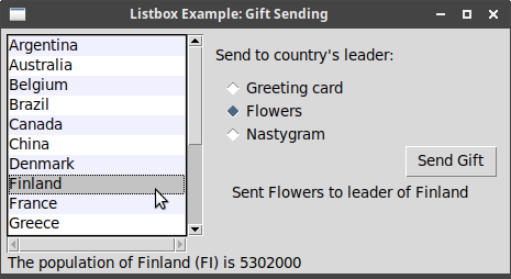
Below is the complete gift/listbox example.
Note that LTk provides us with a "scrolled-listbox", which has scrollbars already attached, as well as the usual "listbox". The "scrolled" version is used here. The following listbox functions apply to both the scrolled and unscrolled versions:
listbox-append (listbox values)
Adds the given values to the listbox instance.
listbox-get-selection (listbox)
Returns a list of selected indices - a list, because multiple items can be selected.
|
|
For nodgui, this appears to be a list with a list of selected indices. See the note below the example below. |
listbox-select (listbox index)
Selects the item at the given index.
For the remainder, you need to use:
(listbox scrolled-listbox)
Accessor to listbox behind scrolled-listbox, e.g. used in bind below.
Remaining functions apply to listbox only:
listbox-configure (listbox index &rest options)
Configures the display of the indexed item - in the example below, this is used to subtly highlight alternating rows.
listbox-clear (listbox)
Empties the listbox.
listbox-delete (listbox start &optional end)
Deletes items with indexes start to end.
listbox-insert (listbox index values)
Inserts the given values just before the indexed item.
listbox-nearest (listbox y-coord)
Returns the index of the item closest to the given y-coordinate.
Example ("listbox-example.lisp") - see note below for nodgui:
;; country databases
;; - the list of country codes (a subset anyway)
;; - parallel list of country names, same order as the country codes
;; - an assoc-list mapping country code to population

(defparameter *country-codes* '(ar au be br ca cn dk fi fr gr in it jp mx nl no
                                   es se ch))
(defparameter *country-names* '("Argentina" "Australia" "Belgium" "Brazil" "Canada" "China"
                                          "Denmark" "Finland" "France" "Greece" "India"
                                          "Italy" "Japan" "Mexico" "Netherlands" "Norway"
                                          "Spain" "Sweden" "Switzerland"))
(defparameter *populations* '((ar . 41000000) (au . 21179211) (be . 10584534) (br . 185971537)
                                              (ca . 33148682) (cn . 1323128240) (dk . 5457415)
                                              (fi . 5302000) (fr . 64102140) (gr . 11147000)
                                              (in . 1131043000) (it . 59206382) (jp . 127718000)
                                              (mx . 106535000) (nl . 16402414) (no . 4738085)
                                              (es . 45116894) (se . 9174082) (ch . 7508700)))
(defparameter *gifts* '(("card" . "Greeting card")
                        ("flowers" . "Flowers") ("nastygram" . "Nastygram")))

(defun get-gift-name (gift)
  (cdr (assoc (string-downcase (string gift)) *gifts*
              :test #'string=)))

(defun send-gift (index gift sent-label)
  "Sends gift with given index, and updates text in sent-label"
  (when (= 1 (length index))
    (let* ((idx (first index))
           (gift (get-gift-name gift))
           (country (nth idx *country-names*)))

      (setf (text sent-label)
            (format nil "Sent ~a to leader of ~a" gift country)))))

(defun show-population (index status-label sent-label)
  "Updates status label with information for given country index"
  (when (= 1 (length index))
    (let* ((idx (first index))
           (code (nth idx *country-codes*))
           (name (nth idx *country-names*))
           (popn (cdr (assoc code *populations*))))
      (setf (text status-label)
            (format nil "The population of ~a (~a) is ~a" name code popn))
      (setf (text sent-label) ""))))

(with-ltk ()
          (wm-title *tk* "Listbox Example: Gift Sending")
          ; create the outer content frame and other widgets
          (let* ((content (make-instance 'frame))
                 (countries (make-instance 'scrolled-listbox :master content))
                 (send-label (make-instance 'label :master content
                                            :text "Send to country's leader:"))
                 (gift-1 (make-instance 'radio-button :master content
                                        :text (get-gift-name "card")
                                        :value "card" :variable "gift"))
                 (gift-2 (make-instance 'radio-button :master content
                                        :text (get-gift-name "flowers")
                                        :value "flowers" :variable "gift"))
                 (gift-3 (make-instance 'radio-button :master content
                                        :text (get-gift-name "nastygram")
                                        :value "nastygram" :variable "gift"))
                 (sent-label (make-instance 'label :master content :text "" :anchor :center))
                 (status-label (make-instance 'label :master content :text "" :anchor "w"))
                 (send (make-instance 'button :master content :text "Send Gift"
                                      :command #'(lambda ()
                                                   (send-gift (listbox-get-selection countries)
                                                              (value gift-1) sent-label))
                                      :default :active))
                 )
            ; grid the outer content frame
            (configure content :padding "5 5 12 0")
            (grid content 0 0 :sticky "nwes")
            (grid-columnconfigure *tk* 0 :weight 1)
            (grid-rowconfigure *tk* 0 :weight 1)
            (grid-columnconfigure content 0 :weight 1)
            (grid-rowconfigure content 5 :weight 1)
            ; grid the other widgets
            (listbox-append countries *country-names*)
            (grid countries 0 0 :rowspan 6 :sticky "nsew")
            (grid send-label 0 1 :padx 10 :pady 10)
            (grid gift-1 1 1 :sticky "w" :padx 20)
            (grid gift-2 2 1 :sticky "w" :padx 20)
            (grid gift-3 3 1 :sticky "w" :padx 20)
            (grid send 4 2 :sticky "e")
            (grid sent-label 5 1 :columnspan 2 :sticky "n" :padx 5 :pady 5)
            (grid status-label 6 0 :columnspan 2 :sticky "we")

            ; Set event bindings for when the selection in the listbox changes,
            ; when the user double clicks the list, and when they hit the Return key
            (bind (listbox countries) "<<ListboxSelect>>"
                  #'(lambda (evt) (show-population (listbox-get-selection countries)
                                                   status-label sent-label)))
            (bind (listbox countries) "<Double-1>"
                  #'(lambda (evt) (send-gift (listbox-get-selection countries)
                                             (value gift-1) sent-label)))
            (bind *tk* "<Return>"
                  #'(lambda (evt) (send-gift (listbox-get-selection countries)
                                             (value gift-1) sent-label)))

            (setf (value gift-1) 'card)
            (listbox-select countries 0)
            (show-population (listbox-get-selection countries) status-label sent-label)
            ; alternate colours in listbox
            (dotimes (i (length *country-names*))
              (when (evenp i)
(listbox-configure (listbox countries) i :background "#f0f0ff")))))|
|
To make this work in nodgui, add the following line to the start of send-gift
and show-population:
|
(setf index (first index))
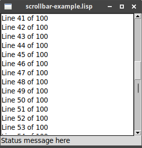
Scrollbar
LTk provides scrolled alternatives to most important widgets, including canvas,
frame, listbox and text.
This example shows how to use the stand-alone scrollbar, if
needed ("scrollbar-example.lisp"):
(wm-title *tk* "scrollbar-example.lisp")
(let ((listbox (make-instance 'listbox :height 5))
      (scrollbar (make-instance 'scrollbar :orientation :vertical))
      (status (make-instance 'label :text "Status message here")))
  (grid listbox 0 0 :sticky "nwes")
  (grid scrollbar 0 1 :sticky "ns")
  (grid status 1 0 :columnspan 2 :sticky "we")

  ; configure the scrollbar and listbox to talk to each other
  (configure scrollbar                                                ;
             :command (format nil "~a yview" (widget-path listbox)))
  (configure listbox                                                  ;
             :yscrollcommand (format nil "~a set" (widget-path scrollbar)))

  (grid-columnconfigure *tk* 0 :weight 1)
  (grid-rowconfigure *tk* 0 :weight 1)

  (dotimes (i 100)
(listbox-append listbox (format nil "Line ~a of 100" (+ 1 i))))) |
Tells the scrollbar to pass scroll information to the listbox |
|
Tells the listbox to pass information to the scrollbar when scrolling |
Text
LTk provides a scrolled-text widget, which attaches scrollbars to the
Tk text widget. To retrieve the underlying text widget, use:
-
textboxin LTk -
inner-textin nodgui
LTk functions on the text widget include (see source for more):
append-newline (text-widget)
Adds a newline to the end of the text data.
append-text (text-widget string)
Appends given string to the end of the text data.
clear-text (text-widget)
Clears the text data.
see (text-widget index)
Adjusts text widget so the indexed location is visible (index is a string in form "linenum.charnum").
text (text-widget)
Accessor method to the underlying text data.
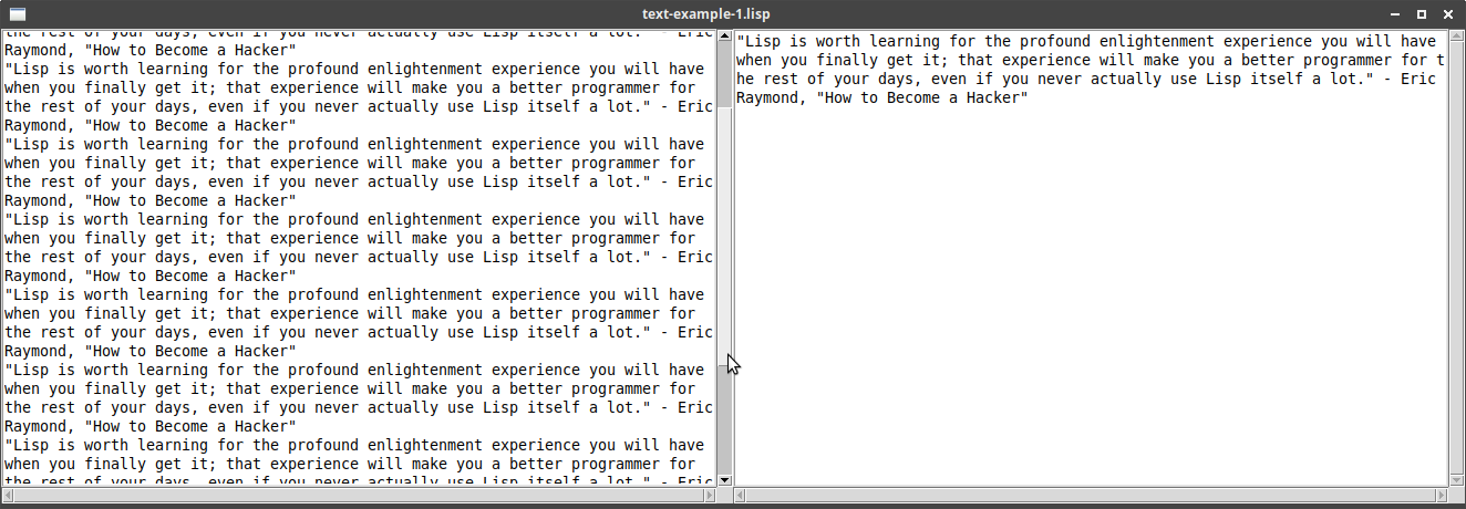
Example of an editable and a readonly text widget
("text-example-1.lisp") - replace textbox with inner-text when using
nodgui:
(wm-title *tk* "text-example-1.lisp")
(let* ((text-1 (make-instance 'scrolled-text :width 30 :height 20))
       (onlisp "\"Lisp is worth learning for the profound enlightenment experience you will have when you finally get it; that experience will make you a better programmer for the rest of your days, even if you never actually use Lisp itself a lot.\" - Eric Raymond, \"How to Become a Hacker\"")
       (text-2 (make-instance 'scrolled-text :width 30 :height 20)))

  (grid-columnconfigure *tk* 0 :weight 1)
  (grid-rowconfigure *tk* 0 :weight 1)

  (configure (textbox text-1) :wrap :word)          ;
  (dotimes (i 10)
    (append-text (textbox text-1) onlisp)           ;
    (append-newline (textbox text-1)))

  (setf (text text-2) onlisp)                       ;
  (configure (textbox text-2) :state :disabled)     ;

  (grid text-1 0 0 :sticky "news")
(grid text-2 0 1 :sticky "news")) |
First text widget is set to wrap on words. |
|
The quote is added 10 times, to fill up the text display. |
|
Sets the text of the second text widget. |
|
Sets the second text widget to be readonly. |
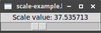
Scale
Example ("scale-example.lisp"):
(wm-title *tk* "scale-example.lisp")
(let* ((label (make-instance 'label :text "Scale value: 20"))
       (scale (make-instance 'scale :orientation :horizontal :length 200    ;
                             :from 1 :to 100
                             :command #'(lambda (val)
                                          (setf (text label)                ;
                                                (format nil "Scale value: ~a" val))))))
  (grid label 0 0)
  (grid scale 1 0 :sticky "we")

(setf (value scale) 20)) ; |
Sets up a scale, with range 1 to 100, with given pixel length and orientation. |
|
The command accepts the current scale value, so we can set an external variable/label with the updated value. |
|
value is used to access/set the value of the scale widget. |
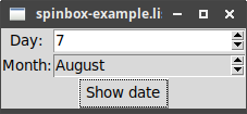
Spinbox
(wm-title *tk* "spinbox-example.lisp")
(let* ((days (make-instance 'spinbox :from 1 :to 31))             ;
       (months (make-instance 'spinbox
                              :state :readonly                    ;
                              :values '("January" "February" "March"
                                        "April" "May" "June" "July"
                                        "August" "September" "October"
                                        "November" "December")))
       (show (make-instance 'button :text "Show date"
                            :command #'(lambda ()
                                         (format t "~a ~a~%"
                                                 (text days)      ;
                                                 (text months))))))
  (grid (make-instance 'label :text "Day:") 0 0)
  (grid days 0 1 :sticky "we")
  (grid (make-instance 'label :text "Month:") 1 0)
  (grid months 1 1 :sticky "we")
(grid show 2 0 :columnspan 2)) |
Creates spinbox with range of numbers. |
|
Creates spinbox from list of string values. :readonly is used so user
can only pick from list of values, not enter their own value. |
|
text is the accessor method to retrieve values from the spinbox. |
Progressbar
(wm-title *tk* "progressbar-example.lisp")
(let* ((bar-1 (make-instance 'progressbar :length 100))
       (bar-2 (make-instance 'progressbar :length 200 :orientation :vertical))
       (bar-3 (make-instance 'progressbar :length 100 :mode :indeterminate)))

  (setf (value bar-1) 50)                                 ;
  (setf (value bar-2) 80)                                 ;

  (grid bar-1 0 0 :padx 5 :pady 5)
  (grid bar-2 0 1 :rowspan 2 :padx 5 :pady 5)
  (grid bar-3 1 0 :padx 5 :pady 5)

(format-wish "~a start ~a" (widget-path bar-3) 10)) ; |
Sets value on horizontal progressbar to 50% |
|
Sets value on vertical progressbar to 80% |
|
Starts the indeterminate progressbar with updates every 10ms |
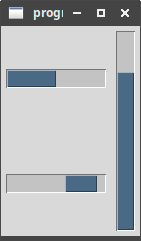
The static image freezes the side-to-side motion of the lower-left progressbar.
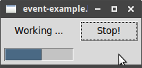
Event Loop
Read event loop.
The "One Step at a Time" example:
(wm-title *tk* "event-example.lisp")
(let ((interrupt nil)
      (button (make-instance 'button :text "Start!"))
      (label (make-instance 'label :text "No Answer"))
      (progressbar (make-instance 'progressbar :orientation :horizontal
                                  :mode :determinate
                                  :maximum 20)))

  (grid button 0 1 :padx 5 :pady 5)
  (grid label 0 0 :padx 5 :pady 5)
  (grid progressbar 1 0 :padx 5 :pady 5)

  (labels ((start ()
                  (setf (text button) "Stop!"
                        (command button) #'stop)
                  (setf (text label) "Working ...")
                  (setf interrupt nil)
                  (after 1 #'next))
           (stop ()
                 (setf interrupt t))
           (next (&optional (count 0))
                 (configure progressbar :value count)
                 (if interrupt                                  ;
                   (result "")
                   (after 100                                   ;
                          #'(lambda ()
                              (if (= count 20)
                                (result 42)
                                (next (+ 1 count)))))))
           (result (answer)
                   (configure progressbar :value 0)
                   (setf (text button) "Start!"
                         (command button) #'start)
                   (setf (text label)
                         (if (numberp answer)
                           (format nil "Answer: ~a" answer)
                           "No answer"))))
(setf (command button) #'start))) |
The interrupt variable is used to decide if we continue the count
or stop. |
|
Calls the enclosed function after 100ms, and so gradually increases
the count. Notice the function calls next recursively, to loop. |
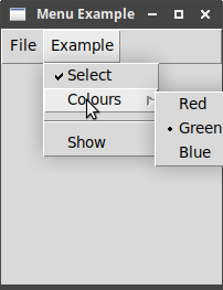
Menus
Read menus.
Menubars
|
|
LTk automatically turns off the "tearoff" feature. |
The following example illustrates most of the points in the
"Menubars" section ("menu-example.lisp"):
(wm-title *tk* "Menu Example")
(let* ((menubar (make-instance 'menubar))                                     ;
       ; add some menus to menubar
       (file-menu (make-instance 'menu :master menubar :text "File"))         ;
       (example-menu (make-instance 'menu :master menubar :text "Example"))
       )
 ; add command items to 'file'
 (make-instance 'menubutton :master file-menu :text "New"                     ;
                :command (lambda () (format t "You clicked 'New'~%")))
 (configure                                                                   ;
   (make-instance 'menubutton :master file-menu :text "Save")
   :state :disabled)
 (add-separator file-menu)                                                    ;
 (make-instance 'menubutton :master file-menu :text "Quit" :underline 0       ;
                :command (lambda () (uiop:quit)))
 ; -- build 'example' menu
 (let* ((check-menu (make-instance 'menucheckbutton :master example-menu      ;
                                   :text "Select"))
        (colours (make-instance 'menu :master example-menu                    ;
                                :text "Colours"))
        (red-button (make-instance 'menuradiobutton :master colours           ;
                                   :text "Red" :name :red :group :colours))
        (green-button (make-instance 'menuradiobutton :master colours
                                     :text "Green" :name :green :group :colours))
        (blue-button (make-instance 'menuradiobutton :master colours
                                    :text "Blue" :name :blue :group :colours)))
   (add-separator example-menu)
   (make-instance 'menubutton :master example-menu :text "Show"
                  :accelerator "Control+S"
                  :command (lambda ()
                             (format t "Values are: ~%Select: ~a~%Colours: ~a~%"
                                     (value check-menu)
(value red-button)))))) |
Menubar is automatically attached to the root. |
|
Menus are attached to the menubar. |
|
Command items have a label ("text") and an action ("command"). |
|
configure can be used to set a menu-item’s state, e.g. to make it disabled/normal. |
|
Adds a separator - horizontal line. |
|
Underlined character can be used in menu navigation. |
|
Creates a check button: call value on the menu item to get/set its state. |
|
Creates a submenu in an existing menu. |
|
Creates a menu-radio button: the :name keyword is used to give each selection a
known value, and the :group keyword is used to tie several radio buttons together
as one set. |
An example session:
$ sbcl --script menu.lisp
Values are:
Select: 1
Colours: GREEN
Points to note:
-
If you are printing to stdout in a command, end with a newline to see the message when you click the button.
-
Checked/unchecked are represented tcl-style as 1/0 (not Lisp’s T/NIL).
-
The
valueof any of themenuradiobuttoninstances holds the name of the selected radio item - here, we print the value of thered-button, and it showsGREEN.
Contextual Menus
Otherwise known as "popup" menus, appearing, e.g., when you right-click on a window.
Example ("popup-menu-example.lisp"):
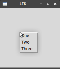
(let ((menu (make-instance 'menu)))                                 ;
  (dolist (item '("One" "Two" "Three"))
    (make-instance 'menubutton
                   :master menu
                   :text item
                   :command (lambda ()
                              (format t "You clicked ~a~%" item))))
  (bind *tk*                                                        ;
        "<3>"                                                       ;
        (lambda (evt)
(popup menu (event-root-x evt) (event-root-y evt))))) ; |
Creates a menu without a "master" menubar, because it will display where requested. |
|
Binds the popup event to the root widget - you can use any widget. |
|
Use the right-mouse button - change this depending on platform. |
|
Displays the popup menu at coordinates taken from the given evt. |
|
See Platform-specific theme for how to detect the current platform, which can be used to decide which button, e.g., is used to trigger the popup menu. |
Windows and Dialogs
Read windows and dialogs.
Creating and destroying windows
make-instance 'toplevel :title "" :master nil
To directly create an instance of the toplevel class.
make-toplevel (&optional master)
Creates a new toplevel window, linked to the given master window.
destroy (toplevel)
Destroys the named window.
Window behaviour and styles
LTk provides functions for most of what is described in the tutorial.
Window title
wm-title (toplevel new-title)
Used to update the toplevel window title.
Size and location
set-geometry (toplevel width height x y)
set-geometry-wh (toplevel width height)
set-geometry-xy (toplevel x y)
Resizable
resizable (toplevel width height)
width/height must be 1/0 to indicate resizing is on/off in that direction.
minsize (toplevel x y)
maxsize (toplevel x y)
Intercepting the close button
on-close (toplevel function)
Calls given function (zero arguments) when the toplevel is closed.
Iconifying and withdrawing
iconify (toplevel)
deiconify (toplevel)
withdraw (toplevel)
Stacking order
lower (toplevel)
raise (toplevel)
Screen information
Covered in section Widget introspection.
Windows example
Example of using some of the window functions ("window-example.lisp"):
(wm-title *tk* "window-example.lisp")
(let* ((window-1 '())
       (window-2 '())
       (open-1 (make-instance 'button :text "Open 1"
                              :command #'(lambda ()
                                           (unless window-1
                                             (setf window-1
                                                   (make-toplevel *tk*))      ;
                                             (wm-title window-1 "window 1")   ;
                                             (iconify window-1)))))           ;
       (open-2 (make-instance 'button :text "Open 2"
                              :command #'(lambda ()
                                           (unless window-2
                                             (setf window-2
                                                   (make-instance 'toplevel   ;
                                                                  :title "window 2 - unresizable"))
                                             (resizable window-2 0 0)))))     ;
       (delete-1 (make-instance 'button :text "Close 1"
                                 :command #'(lambda ()
                                              (when window-1
                                                (destroy window-1)            ;
                                                (setf window-1 nil)))))
       (delete-2 (make-instance 'button :text "Close 2"
                                 :command #'(lambda ()
                                              (when window-2
                                                (destroy window-2)
                                                (setf window-2 nil)))))
       )

  (on-close *tk*                                                              ;
            #'(lambda ()
                (when (ask-yesno "Do you really want to close?"
                                 :title "Closing program")
                  (uiop:quit))))

  (format t "Geometry of root at start: ~a~&" (geometry *tk*))                ;

  (grid open-1 0 0)
  (grid open-2 0 1)
  (grid delete-1 1 0)
  (grid delete-2 1 1)

(format t "Geometry of root when filled: ~a~&" (geometry *tk*))) |
Use the function to create a new window - it is linked to the root window *tk*. |
|
Set the title using the separate wm-title function. |
|
Iconify the window. |
|
Create a window directly using the toplevel class. We can set the title
on construction. |
|
Change window so it cannot be resized. |
|
Destroys the named window. |
|
Asks user to confirm that they really want to close the program. |
|
Displays the root geometry before and after adding the buttons. |
Dialog windows
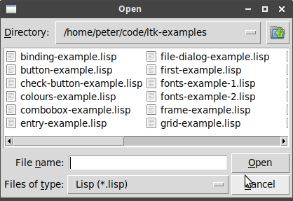
Selecting files and directories
LTk provides three convenient functions for accessing the file dialogs:
get-open-file (&key filetypes initialdir multiple parent title)
To select a file to open. Warns if you do not select an existing file.
-
filetypes- sets a list of filetype filters, e.g.( ("Lisp" ".lisp") ("Scheme" ".scm") ) -
initialdir- directory to start in -
multiple- T/nil to allow selecting multiple files -
parent- logical parent of dialog - dialog is centered on the parent -
title- title of open dialog
|
|
For nodgui, use file-types and initial-dir
|
get-save-file (&key filetypes)
As above, except to select a filename for saving. Warns if you select an existing file.
-
filetypes- sets a list of filetype filters, e.g.( ("Lisp" ".lisp") ("Scheme" ".scm") )
|
|
For nodgui, use file-types
|
choose-directory (&key initialdir parent title mustexist)
Used to select a directory, rather than a file.
-
initialdir- directory to start in -
parent- logical parent of dialog - dialog is centered on the parent -
title- title of dialog -
mustexist- T/nil to require selection to exist
|
|
For nodgui, use initial-dir
|
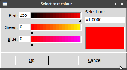
Selecting colours
choose-color (&key parent title initialcolor)
-
parent- logical parent of dialog - dialog is centered on the parent -
title- title of dialog -
initialcolor- the initial shown colour
|
|
For nodgui, use initial-color
|
Returns the RGB string of selected colour, or empty string if cancelled.
(let ((colour (choose-color :title "Select text colour"
                            :initialcolor :red)))             ;

  (when (string= colour "")
    (setf colour :blue))

  (grid (make-instance 'label
                       :text (format nil "In colour ~a" colour)
                       :foreground colour)
0 0)) |
For nodgui, replace with :initial-color :red))) |
Selecting fonts
|
|
LTk currently does not support the font chooser. |
Alert and confirmation dialogs
LTk provides the following functions:
ask-okcancel (message &key title parent)
-
message- message to display -
title- title of dialog -
parent- logical parent of dialog - dialog is centered on the parent
ask-yesno (message &key title parent)
-
message- message to display -
title- title of dialog -
parent- logical parent of dialog - dialog is centered on the parent
do-msg (message &key title parent)
-
message- message to display -
title- title of dialog -
parent- logical parent of dialog - dialog is centered on the parent
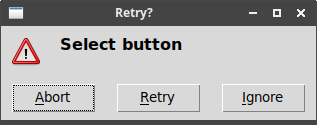
message-box (message title type icon &key parent)
-
message- message to display -
title- title of dialog -
type- one of "ok" "okcancel" "yesno" "yesnocancel" "retrycancel" "abortretryignore" -
icon- one of "error" "info" "question" "warning" -
parent- logical parent of dialog - dialog is centered on the parent
Using these in a REPL:
* (with-ltk () (format t "Result: ~a~&" (ask-yesno "Do we like LTk?")))
Result: T
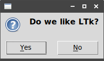
(Result is T for clicking 'yes', nil for clicking 'no'.)
* (with-ltk () (format t "Result: ~a~&" (message-box "Select button" "Retry?" :abortretryignore "warning")))
Result: RETRY
Organising Complex Interfaces
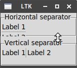
Separator, Label Frame and Paned Window
The first three widgets discussed organise widgets appearing within a single view.
The separator is used to divide up groups, the labelframe to place widgets into
named groups, and the panedwindow is a way to allow groups to be resized after
display.
These three are all illustrated in the following example
("separator-example.lisp"):
(let ((panes (make-instance 'paned-window)))                              ;
  (grid panes 0 0 :sticky "nsew")
  (grid-columnconfigure *tk* 0 :weight 1)
  (grid-rowconfigure *tk* 0 :weight 1)

  (let ((frame (make-instance 'labelframe                                 ;
                              :master panes
                              :text "Horizontal separator")))
    (grid (make-instance 'label :master frame :text "Label 1")
          0 0)
    (grid (make-instance 'separator :master frame)                        ;
          1 0 :sticky "we")
    (grid (make-instance 'label :master frame :text "Label 2")
          2 0)
    (grid frame 0 0 :padx 5 :pady 5)
    (add-pane panes frame))                                               ;

  (let ((frame (make-instance 'labelframe
                              :master panes
                              :text "Vertical separator")))
    (grid (make-instance 'label :master frame :text "Label 1")
          0 0)
    (grid (make-instance 'separator :master frame :orientation :vertical) ;
          0 1 :sticky "ns")
    (grid (make-instance 'label :master frame :text "Label 2")
          0 2)
    (grid frame 0 0 :padx 5 :pady 5)
(add-pane panes frame))) |
Creates the paned-window, which fills the root. |
|
Creates a labelled frame inside the paned-window, with text being the
label. |
|
Create a separator - use :sticky "we" option so the line fills the
horizontal space. |
|
Add the labelled frame as a pane to the paned-window. |
|
Here we use a :vertical separator to separate the two labels, and :sticky "ns"
for the layout. |
The result illustrates both the labelled frames and separators. The double-headed arrow appears when the mouse cursor is run over the separation in the paned-window: clicking and dragging resizes the two halves.
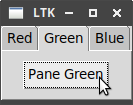
Notebook
The last organisational widget discussed arranges widgets into separate pages, each of which can be brought to the front by clicking on a tab.
Example ("notebook-example.lisp"):
(let ((notebook (make-instance 'notebook)))                 ;
  (grid notebook 0 0 :sticky "news")
  (grid-columnconfigure *tk* 0 :weight 1)
  (grid-rowconfigure *tk* 0 :weight 1)

  ;; add three panes to the notebook
  (dolist (pane '("Red" "Green" "Blue"))
    (let ((frame (make-instance 'frame :master notebook)))  ;
      (grid (make-instance 'button
                           :master frame
                           :text (format nil "Pane ~a" pane)
                           :command (lambda ()
                                      (format t "Clicked on button in pane ~a~%" pane)))
            0 0
            :padx 10
            :pady 10)
(notebook-add notebook frame :text pane)))) ; |
Creates an instance of the notebook. |
|
One frame is made per page to hold its contents. |
|
The notebook-add function adds the frame to the notebook, with the
:text keyword specifying the label for the tab. |
Fonts, Colours, Images
Read fonts, colours, images.
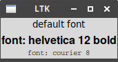
Fonts
The most direct way of working with fonts is using descriptions.
Example of using different fonts on labels ("fonts-example-1.lisp"):
(let ((label-1 (make-instance 'label :text "default font"))
      (label-2 (make-instance 'label :text "font: helvetica 12 bold"
                              :font "Helvetica 12 bold"))             ;
      (label-3 (make-instance 'label :text "font: courier 8"
                              :font "Courier 8")))

  (grid label-1 0 0)
  (grid label-2 1 0)
(grid label-3 2 0)) |
The :font keyword accepts a font description. |
LTk provides the following functions for working with named fonts (these are fonts we give a name to, so we can retrieve and use them later):
font-configure (name &key family size weight slant underline overstrike)
To change the given property of the named font.
font-create (name &key family size weight slant underline overstrike)
To create a new font with the given name, with given properties.
font-delete (&rest names)
Delete the named fonts.
font-metrics (font)
Return some information on the named font.
font-families
Returns a list of all the fonts installed on the current platform.
Example of creating a font and using it on a label
("fonts-example-2.lisp"):
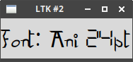
(let ((fonts (sort (font-families) #'string<)))                             ;
  (format t "There are ~d font families, e.g. ~&\"~a\" ~&\"~a\" ~&\"~a\"~&"
          (length fonts) (first fonts)
          (second fonts) (nth 200 fonts))

  (font-create "special-font" :family (second fonts))                       ;
  (format t "Metrics for our font are: ~a~&" (font-metrics "special-font")) ;
  (font-configure "special-font" :size 24)                                  ;
  (format t "-- after setting size 24: ~a~&" (font-metrics "special-font"))

  (grid (make-instance 'label
                       :text (format nil "font: ~a 24pt" (second fonts))
                       :font "special-font")                                ;
0 0)) |
Retrieve the available font families. |
|
Create a new font called "special-font" based on one of the retrieved font families. |
|
Display some metrics about the font. |
|
Alter the font, to increase its size (this could be done on creation). |
|
Use the font by name in a label. |
Printed output:
$ sbcl --script fonts-example-2.lisp
There are 391 font families, e.g.
"Abyssinica SIL"
"Ani"
"Noto Sans Kayah Li"
Metrics for our font are: (ASCENT 20 DESCENT 8 LINESPACE 28 FIXED 0)
-- after setting size 24: (ASCENT 40 DESCENT 15 LINESPACE 55 FIXED 0)
Displayed font:
Colours
Example of coloured text:
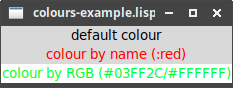
(wm-title *tk* "colours-example.lisp")
(let ((label-1 (make-instance 'label :text "default colour"))
      (label-2 (make-instance 'label :text "colour by name (:red)"
                              :foreground :red))                              ;
      (label-3 (make-instance 'label :text "colour by RGB (#03FF2C/#FFFFFF)"
                              :foreground "#03FF2C"                           ;
                              :background "#FFFFFF")))                        ;

  (grid label-1 0 0)
  (grid label-2 1 0)
(grid label-3 2 0)) |
Sets foreground (text) colour using a name. |
|
Sets foreground (text) colour using RGB. |
|
Sets background colour using RGB. |
Images
Image handling is different in LTk and nodgui.
If using LTk
make-image
Creates an empty image.
image-load (image filename)
Loads an image in given filename into the given image.
An example of using this is in the Label section.
If using nodgui
make-image (filename)
Loads an image in given filename and returns a new image.
An example of using this is in the Label section, with the indicated change.
Canvas
Read canvas.
LTk provides a scrolled-canvas class, to handle scrolling on a canvas. To
draw on the actual canvas, you need to access the canvas within the scrolled
canvas, as in the example in
the LTk manual:
(let* ((sc (make-instance 'scrolled-canvas :height 400 :width 400))
       (c (canvas sc)))

  (grid sc r c)

  ; code to handle the canvas works with `c`
  )
Creating items
Item types
|
|
Some of the following types have a create-TYPE and a make-TYPE function.
The create-TYPE function directly calls Tk, whereas the make-TYPE function
creates an instance of a Lisp class first. The create-TYPE function returns
a tk-reference, which can be used in calls to itemconfigure, whereas the
make-TYPE function returns a lisp-reference, which can be used in calls to
configure.
|
For example, here are two ways to create a blue line in the sketchpad program:
(itemconfigure canvas
               (create-line canvas (list last-x last-y x y))
:fill :blue)(configure (make-line canvas (list last-x last-y x y))
:fill :blue) create-arc (canvas x0 y0 x1 y1 &key (start 0) (extent 180) (style "pieslice")
-
style- one of "pieslice" "arc" or "chord"
create-bitmap (canvas x y &key (bitmap nil))
create-image (canvas x y &key image)
create-line (canvas coords) - make-line (canvas coords)
-
canvas- the canvas to draw the line on -
coords- list of numbers, each pair representing an (x,y) coordinate
create-oval (canvas x0 y0 x1 y1) - make-oval (canvas x0 y0 x1 y1)
create-polygon (canvas coords) - make-polygon (canvas coords)
create-rectangle (canvas x0 y0 x1 y1) - make-rectangle (canvas x0 y0 x1 y1)
create-text (canvas x y text)
Event bindings
Use bind with either the canvas or canvas-item to bind an event, as covered in
Binding to events, e.g.:
(let ((r (make-rectangle canvas 10 10 30 30)))
  (configure r :fill :red)
(bind r "<1>" #'(lambda (evt) (setf colour :red))))-
binds a left-click to the given rectangle.
Tags
Use configure to add a tag to an item, e.g.:
(configure (make-line canvas (list 0 0 10 10))
           :tag "tag-name")
You can later change tagged items using tag-configure, e.g.:
(tag-configure canvas "tag-name" :width 1)Sketchpad
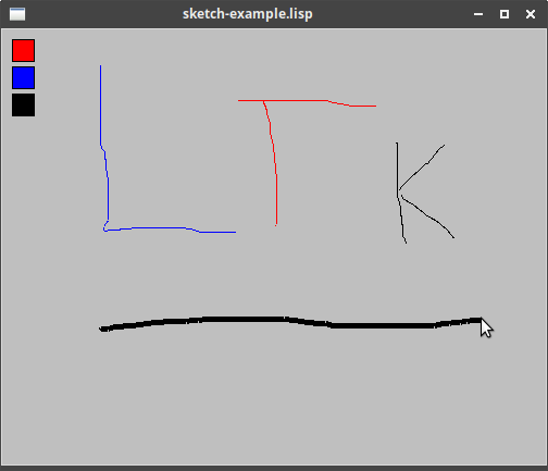
Example of many of above ("sketch-example.lisp"):
(wm-title *tk* "sketch-example.lisp")
(let* ((last-x 0)
       (last-y 0)
       (colour :blue)
       (canvas (make-instance 'canvas :width 500 :height 400 :background :gray75))  ;
       (add-line #'(lambda (x y)
                     (configure (make-line canvas (list last-x last-y x y))         ;
                                :fill colour
                                :width 5
                                :tag "currentline")                                 ;
                     (setf last-x x
                           last-y y))))

  (grid canvas 0 0 :sticky "news")
  (grid-columnconfigure *tk* 0 :weight 1)
  (grid-rowconfigure *tk* 0 :weight 1)

  (bind canvas "<1>" #'(lambda (evt) (setf last-x (event-x evt)                     ;
                                           last-y (event-y evt))))
  (bind canvas "<B1-Motion>"                                                        ;
        #'(lambda (evt) (funcall add-line (event-x evt) (event-y evt))))
  (bind canvas "<B1-ButtonRelease>"                                                 ;
        #'(lambda (evt) (tag-configure canvas "currentline" :width 1)))

  ;; add three rectangles, and option to change colour
  (let ((r (make-rectangle canvas 10 10 30 30)))
    (configure r :fill :red)
    (bind r "<1>" #'(lambda (evt) (setf colour :red))))                             ;
  (let ((r (make-rectangle canvas 10 35 30 55)))
    (configure r :fill :blue)
    (bind r "<1>" #'(lambda (evt) (setf colour :blue))))
  (let ((r (make-rectangle canvas 10 60 30 80)))
    (configure r :fill :black)
(bind r "<1>" #'(lambda (evt) (setf colour :black))))) |
Creates the canvas |
|
Adds a line onto the canvas - notice the last argument is a list of pairwise-points. |
|
Adds a tag to the line, to reference later. |
|
Binds the left-button-down event, to start a coordinate. |
|
Binds the mouse-movement event, to draw a line from last point to current point. |
|
On mouse release, uses a tag to change width of last line. |
|
Bind an event to the rectangle. |
Text Widget
Read text.
|
|
LTk does not currently provide specific functions to support many of the
advanced features available with the text widget. However, these are available
by directly calling Tk using format-wish - see how this is done in the
following example. Most of the functions provided with LTk have been described
above in Text.
|
Example of using some text features, the 24-line log
("text-example-2.lisp"):
(defun write-to-log (msg log-text)
  "Adds 'msg' to given 'log-text', but ensures only 24-lines are shown"
  (let ((num-lines (length (uiop:split-string (text log-text)
                                              :separator (string #\newline)))))
  (configure log-text :state :normal)                                     ;
  (when (= num-lines 24)
    (format-wish "~a delete 1.0 2.0" (widget-path log-text)))             ;
  (append-text log-text msg)
  (append-newline log-text)
  (configure log-text :state :disabled)))                                 ;

(with-ltk
  ()
  (wm-title *tk* "text-example-2.lisp")
  (let ((log-text (make-instance 'text :height 24 :width 80
                                 :wrap :none :state :disabled)))
    (grid log-text 0 0 :sticky "nsew")
    (grid-columnconfigure *tk* 0 :weight 1)
    (grid-rowconfigure *tk* 0 :weight 1)

    (labels ((write-msgs (n)
                         (unless (> n 100)
                           (after 100
                                  #'(lambda ()
                                      (write-to-log
                                        (format nil "Log message ~a of 100" n)
                                        log-text)
                                      (write-msgs (+ 1 n)))))))
(write-msgs 1)))) |
To append text, we need it to be in normal state first. |
|
Call out to format-wish to perform the delete command. Notice the use
of widget-path to obtain the Tk-name for the text widget. |
|
Return the text widget to a readonly state. |
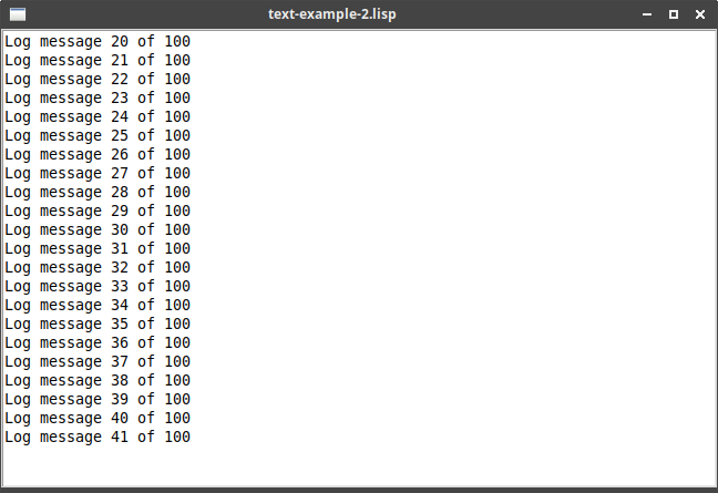
(The count of lines is not quite right, due to empty lines!)
Treeview
Read treeview.
|
|
LTk currently does not support Treeview. |
Styles and Themes
Read styles and themes.
Using existing themes
There are two functions to work with the existing themes - these have been exported in nodgui but not in LTk:
ltk::theme-names or nodgui:theme-names
Returns the available themes, which vary depending on your platform.
On my Linux system, these are: (clam alt default classic)
ltk::use-theme (theme) or nodgui:use-theme (theme)
Call this at the start of your program, and pass in the required theme (as a string).
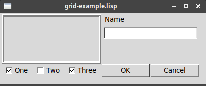
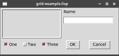
On the grid-example program, the four choices look as follows:
Platform-specific theme
Windows and MacOS support their own specific themes: "winnative" and "aqua", for example. We can make our program set an appropriate theme per platform, using functions from uiop to detect which platform the program is currently running on:
(ltk::use-theme                       ;
  (cond
    ((uiop:os-macosx-p) "aqua")
    ((uiop:os-windows-p) "winnative")
(t "default"))) |
Or (nodgui:use-theme |
|
|
uiop is part of asdf, so you do not need to install anything else.
|